Cluster Manager report results are displayed on this page. These reports provide many types of analytics about your build Cluster and use several types of data visualization, such as scatter plots and pie charts. The following reports are available:
| Report | Description |
|---|---|
Stacked area chart that shows the agent license count and peak agents available versus peak agent demand in a specified time period. |
|
Scatter plot that shows the durations of builds over a specified time period. |
|
Scatter plot of build duration versus the number of conflicts per build. |
|
Scatter plot of build duration versus the number of jobs per build. |
|
Table that shows aggregate statistics (average wait time and total workload) that are grouped by either build class or build name. |
|
Scatter plot that shows the wait times for builds over a specified time period. |
|
Two stacked, stepped line charts that represent peak agent demand and peak running builds over a specified time period. |
|
Skyline chart that shows the number of running builds at any time, how many were of each build class or build name pattern as specified, and the concurrency license count (limit) if not set to “unlimited” in the license file. |
|
Pie chart that shows the effective agent allocation percentage that is reported by eMake for a specified time period. |
|
Stacked bar chart that shows the effective agent allocation percentage that is reported by eMake per day. |
|
Skyline chart that shows concurrent builds at any time (stacked by JobCache license request results) to show how many were able to use JobCache. |
|
Several pie charts that show job cache requests and their results. |
|
Chart that shows the peak number of simultaneous builds that ran on each resource over a specified time period. |
|
Plot of peak agent demand against a backdrop of projected cluster sizes at or above 100%. |
Certain reports use statistics about resources. The Cluster Manager keeps resource statistics for 30 days by default. To ensure that results appear in these reports, you must specify only date ranges for the time period for which resource statistics exist.
Note that reports assume that the Cluster Manager and your browser are in the same time zone. The dates assume that time zone.
Checking Your Permissions to Run Reports
You must have “read” permission to run reports. You can verify that you have this permission in the Reports column in the Permissions subtab under the Administration tab. (The Cluster Manager administrator always has permissions to run any report.)
Certain reports also require “read” permission for resources. If you do not have the required “read” permissions to run a report, ask your Cluster Manager administrator to add them.
Using Permanent Links to Reports
Most reports include a Permalink button, which provides permanent, direct access to a report. Click the Permalink button to browse to the version of the report with a permanent URL, which you can bookmark in your browser or send to others for convenient viewing.
Downloading Report Data
Most reports include a Download CSV button, which downloads report data into a .csv (comma-separated values) file. You can open this file in a spreadsheet application such as Microsoft Excel.
Agent Usage Report
This report is a stacked area chart that shows the agent license count and peak agents available versus peak agent demand in a specified time period:
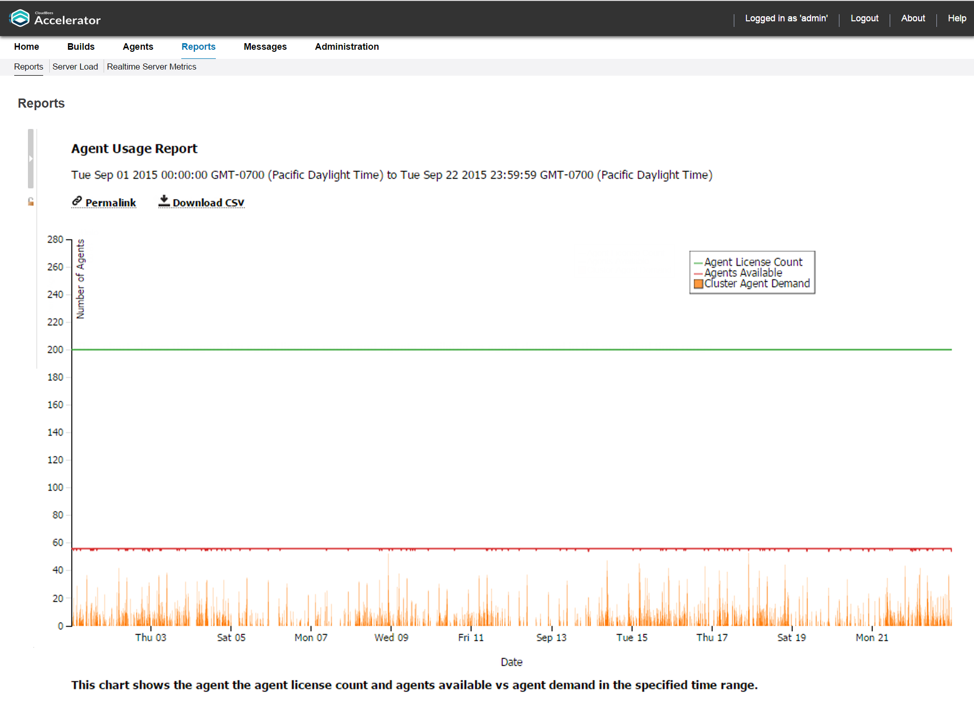
You can input one or more resource names. If no resource name is specified, the cumulative usage for the entire Cluster is shown.
The number of agents available should remain fairly constant at the number of agents in the Cluster. Discrepancies could result from one of the following: network issues might be causing agents to become unavailable, there might be maintenance performed on agents, or there might be an issue with the agents themselves. A sustained level of agent shortage indicates that the Cluster is probably too small.
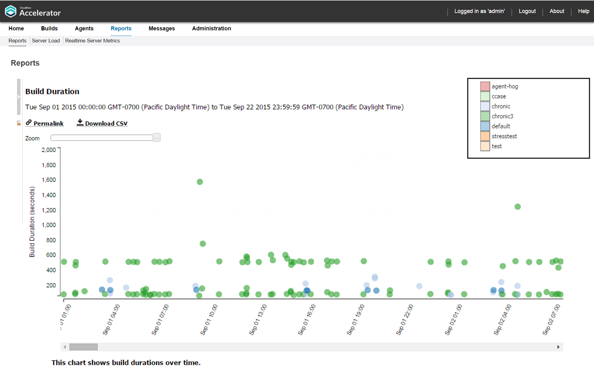
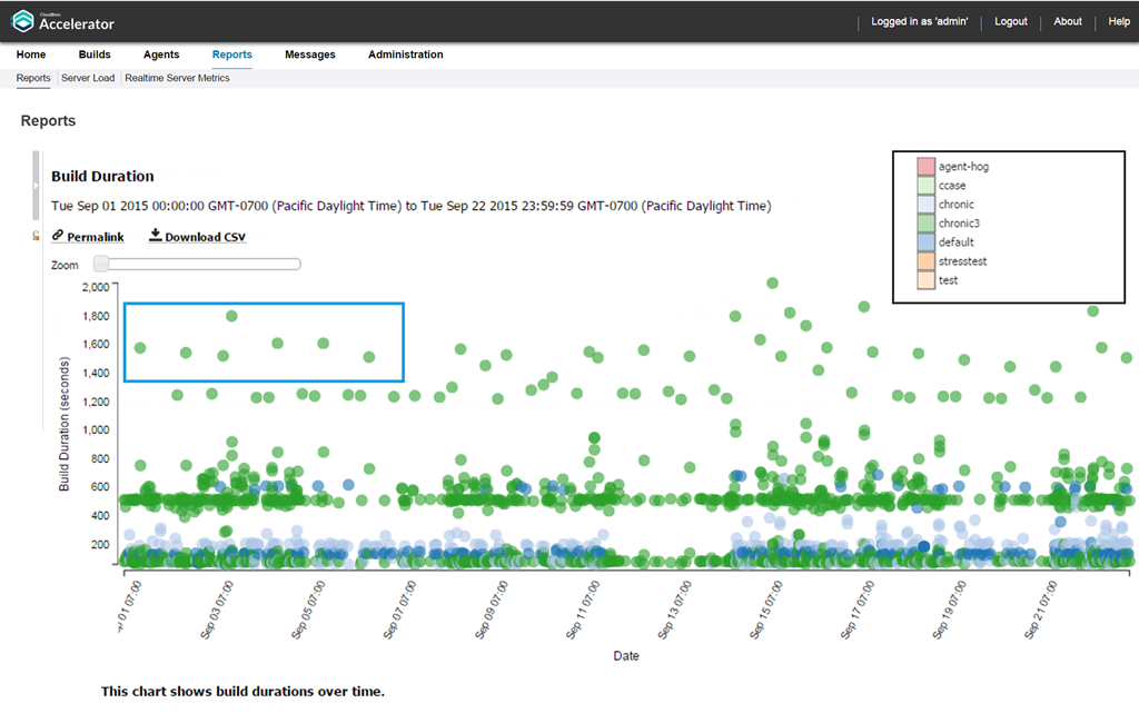
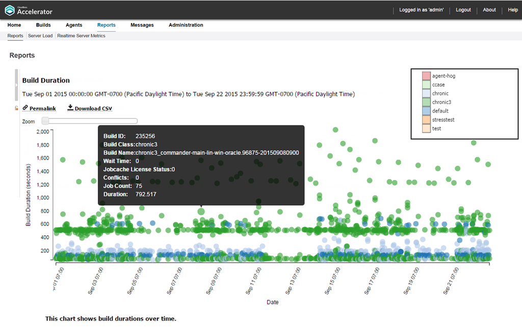
Build Duration Report
This report is a scatter plot that shows the durations of builds over a specified time period:
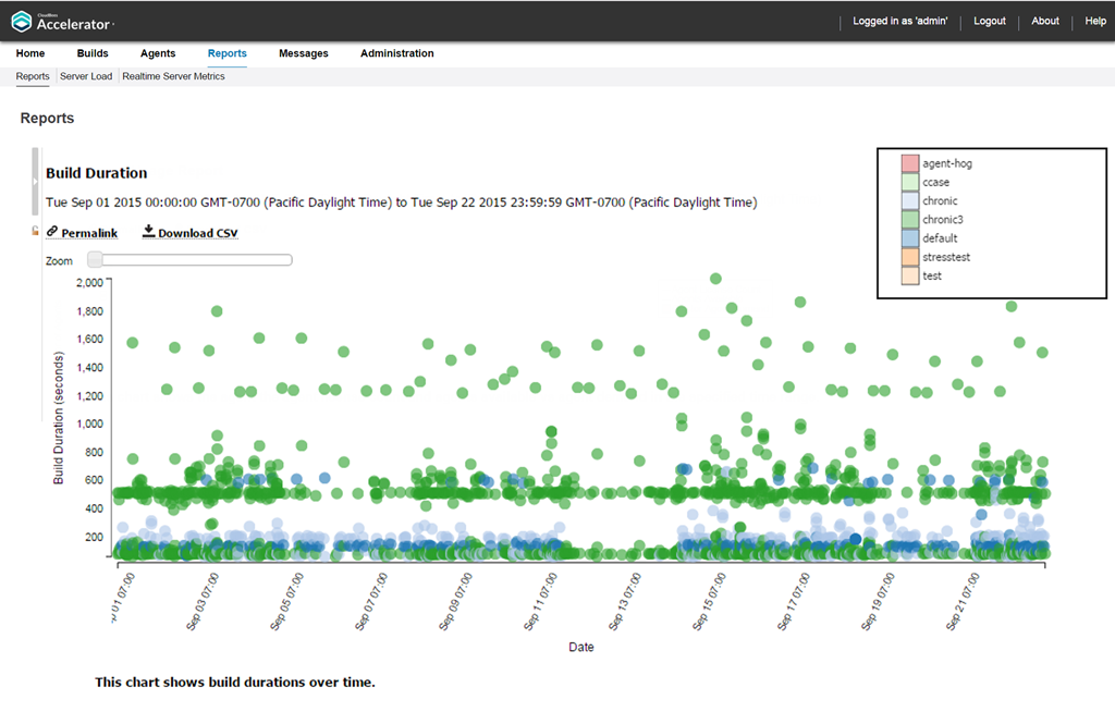
You can input a build class or a build name along with a date range. You can also specify whether you want builds (points) to be colored by build class or build name.
This report is most useful to identify outliers in build or build class wait times, especially when build classes can be used to group similar builds together.
You can scroll or zoom to see a larger range or zoom in on a Cluster of builds that are close together:
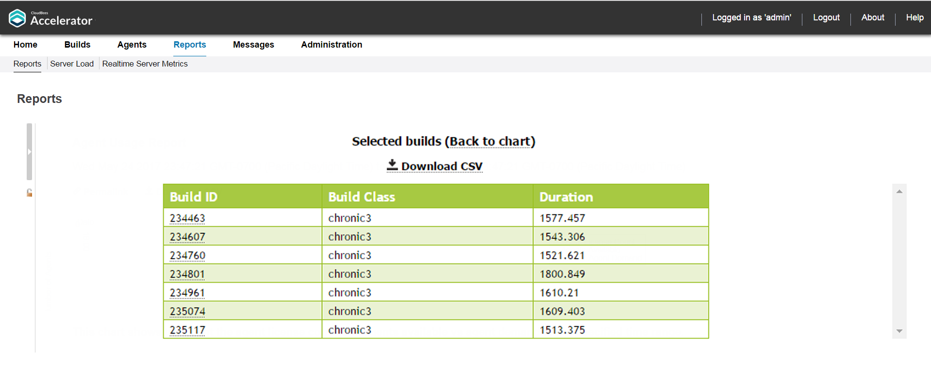
As with other scatter plots, you can click and drag to select multiple builds to view a table that shows details for those builds:
Following is a table of build details for the set of builds selected above:
You can hover over a build for details:
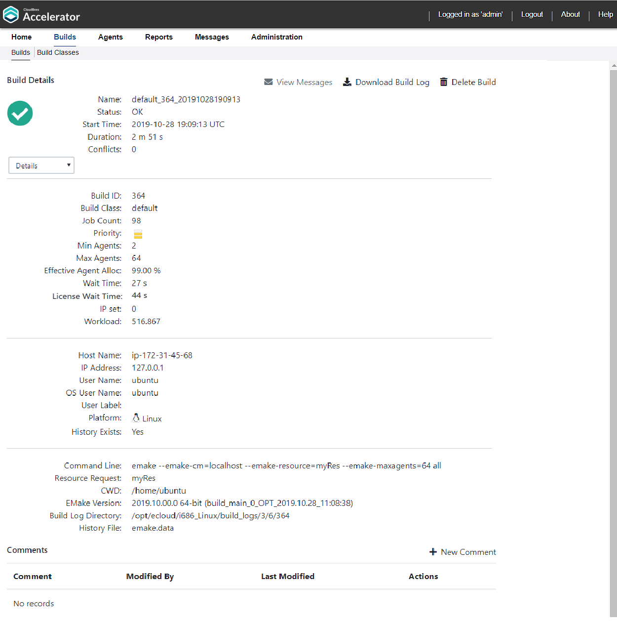
You can click a build to navigate to the Build Details page for that build:
Build Duration vs. Conflict Report
This report is a scatter plot of build duration versus the number of conflicts per build:
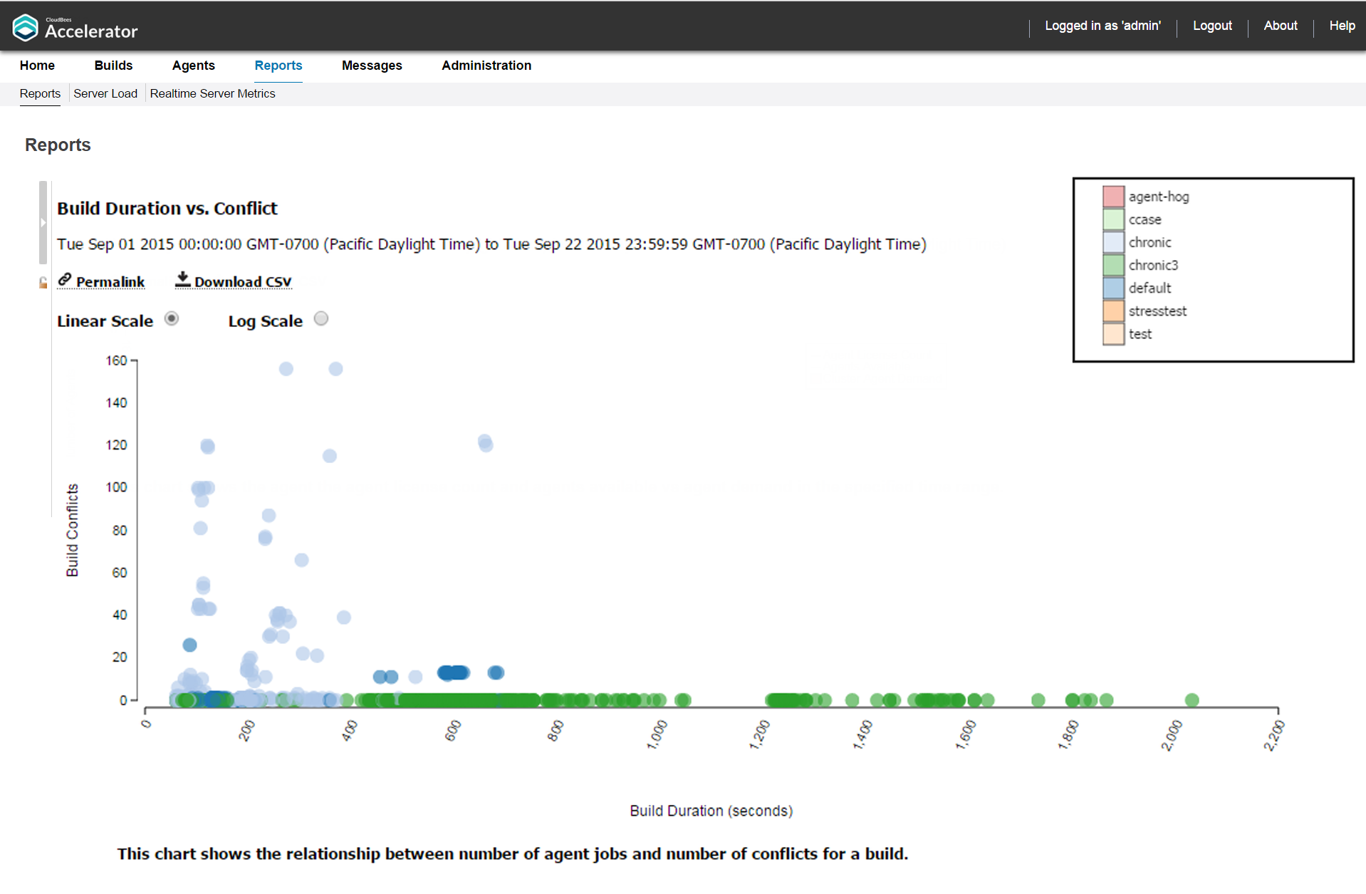
You can input a build class or one or more build names along with a date range. Also, you can specify a threshold for conflicts in a build. Builds with conflicts lower than the threshold are filtered out. You can also select whether to color the report by build class or build name.
As with other scatter plots, you can hover over a build for details about that build and can click a build to navigate to the Build Details page for that build (see the screenshots in Build Duration Report above for an example). Also, as with other scatter plots, you can click and drag to select multiple builds to view a table that shows details for those builds (see the screenshots in Build Duration Report above for examples). You can switch from linear scale (the default) to logarithmic scale.
Build Duration vs. Job Count Report
This report is a scatter plot of build duration versus the number of jobs per build:
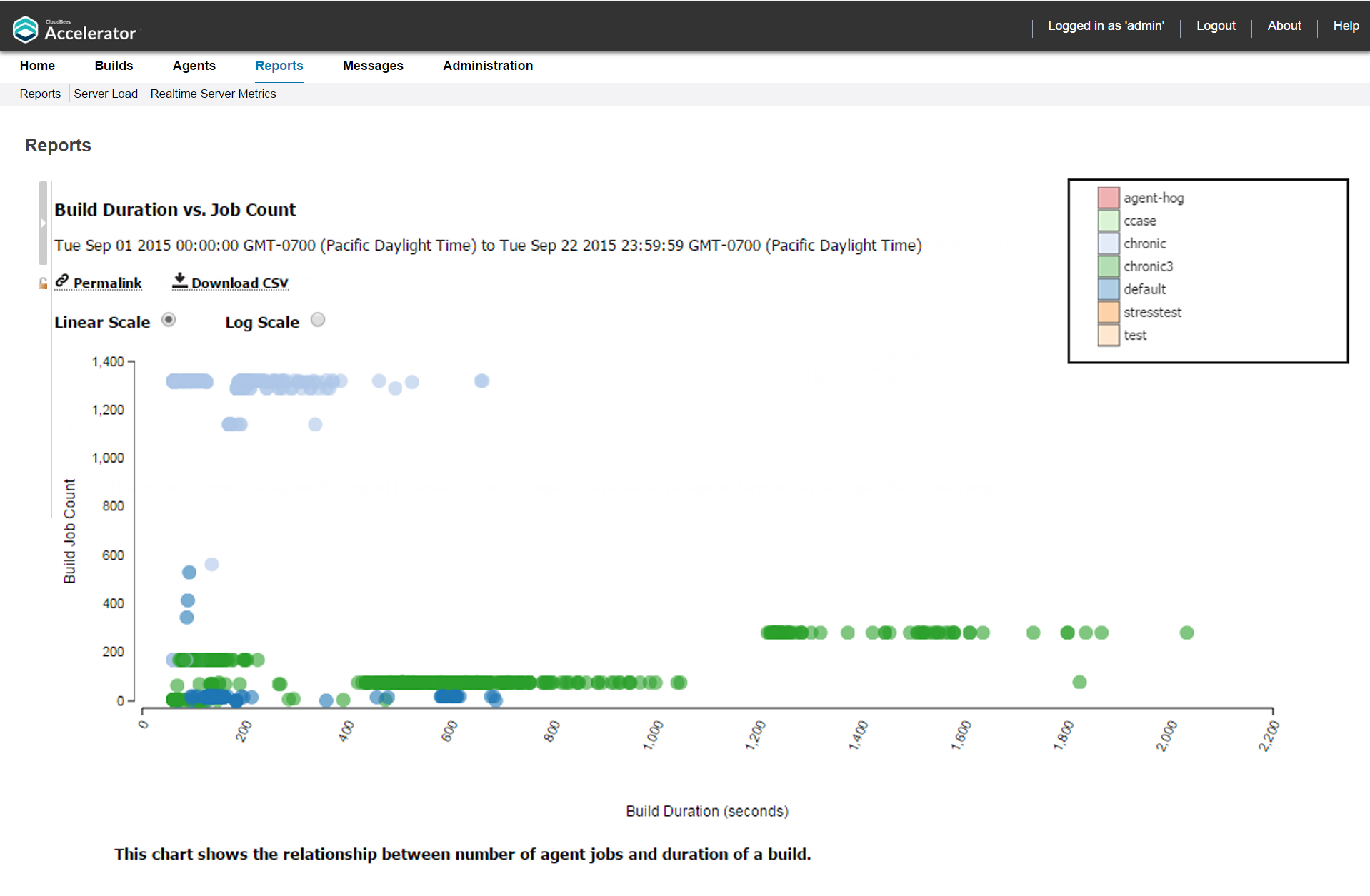
You can input a build class or one or more build names along with a date range. You can also select whether to color the report by build class or build name.
As with other scatter plots, you can hover over a build for details about that build and can click a build to navigate to the Build Details page for that build (see the screenshots in Build Duration Report above for an example). Also, as with other scatter plots, you can click and drag to select multiple builds to view a table that shows details for those builds (see the screenshots in Build Duration Report above for examples). You can switch from linear scale (the default) to logarithmic scale.
Build Summary Report
This report is a table that shows aggregate statistics (average wait time and total workload) that are grouped by either build class or build name:
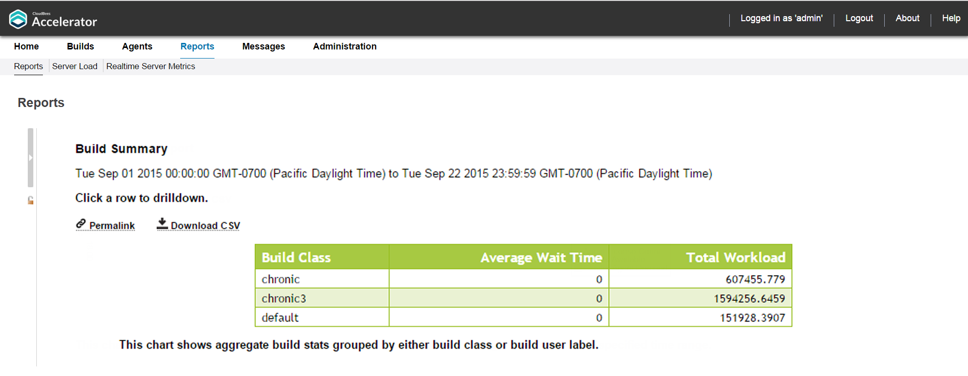
You can input a date range. You can also select whether to group by build class (the default) or by build name patterns, where you can specify a list of build names through wild card patterns.
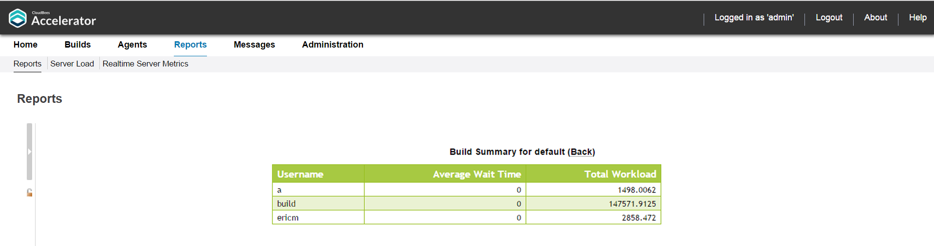
You can click a build class to see builds for that class grouped by user:
This report is useful for chargebacks to business units that are using the Cluster.
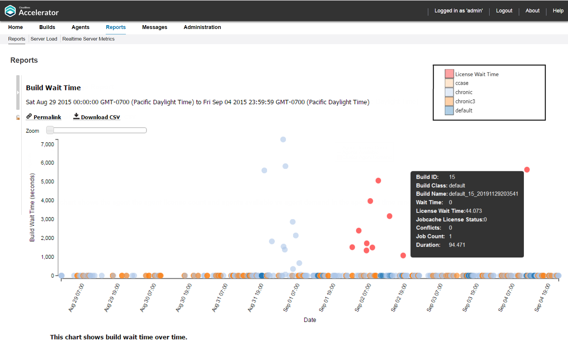
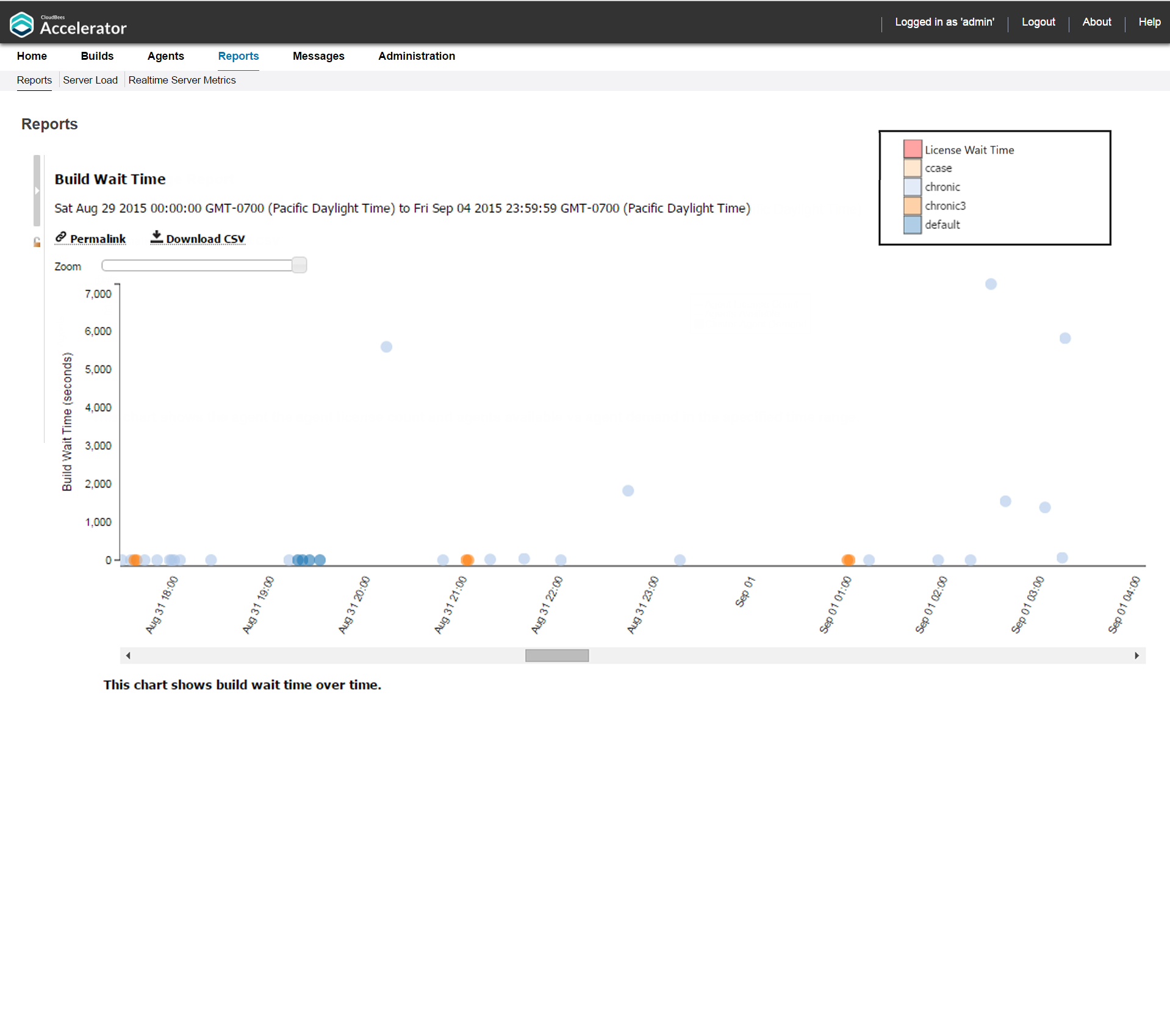
Build Wait Time Report
This report is a scatter plot that shows the wait times for builds over a specified time period:
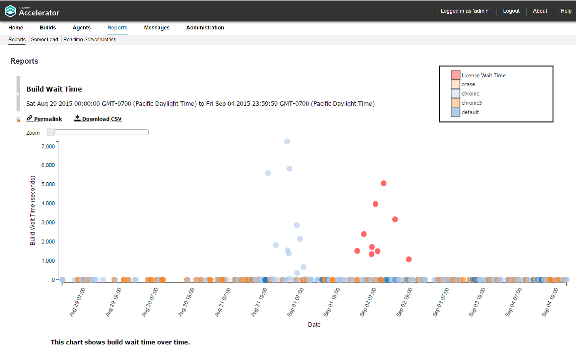
Wait time is the time when eMake has no agents or concurrent build licenses available to run the build. A high number of builds with non-zero wait times indicates that the cluster might be too small, or that the number of concurrent build licenses might be inadequate.
You can specify a build class or one or more build names along with a date range as input.
Also, as with other scatter plots, you can click and drag to select multiple builds to view a table that shows details for those builds (see the screenshots in Build Duration Report above for examples).
You can hover over a build for details about that build:
You can use the Zoom slider to zoom in on a cluster of points that are close together:
You can click a build to navigate to the Build Details page for that build:
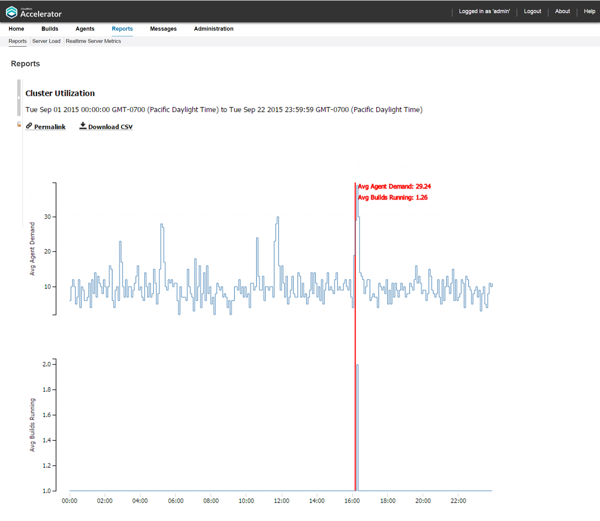
Cluster Utilization Report
This report is two stacked, stepped line charts that represent the peak number of builds running and the peak combined agent demand from all running builds over a specified time period:
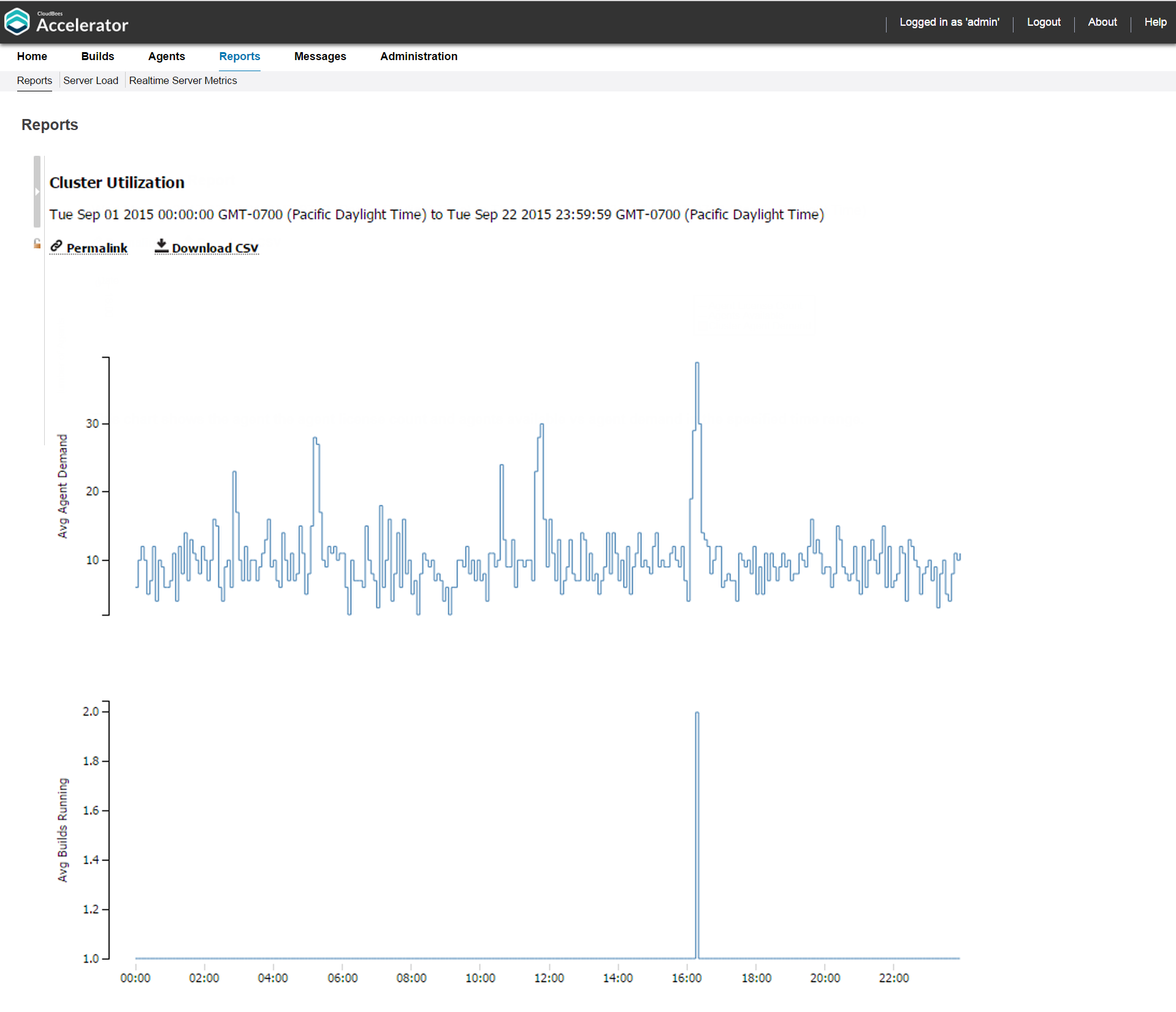
You can input a date range along with a resource name.
You can hover over the chart to see the average agent demand and average builds running at any point of time:
To view this report, you must have “read” permission for resources and reports. For details, see Checking Your Permissions to Run Reports above. If you do not have “read” permission for both, reports will still be available, but the following popup appears: Error: AccessDenied: User <username> does not have the required ResourcesRead privileges to perform this operation.
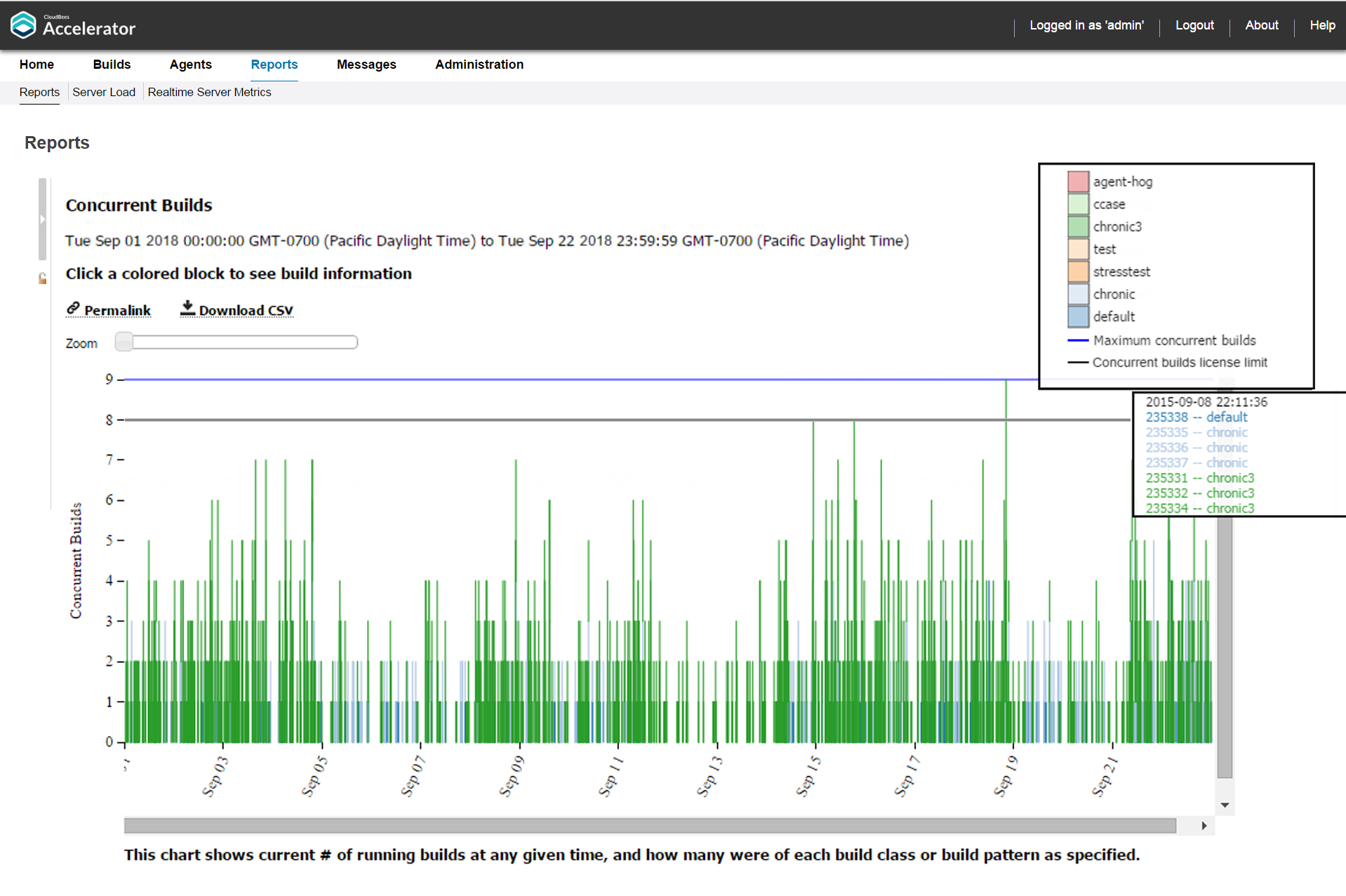
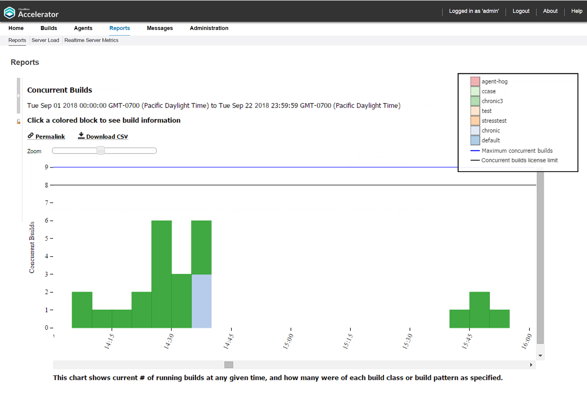
Concurrent Builds Report
This report is a skyline chart, stacked by build class, that shows the current number of running builds at any time and how many were of each specified build class or build name pattern:
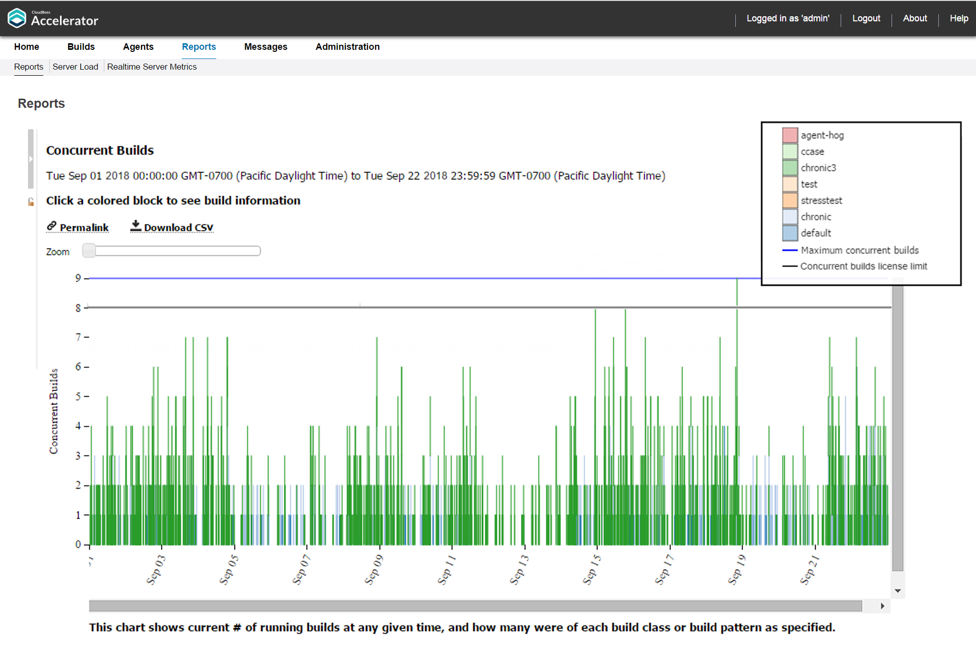
This report also shows the concurrency license count (limit) if not set to “unlimited” in the license file. The license limit is 8 concurrent builds in the example above.
You can input a date range, a sample interval size (the default is five minutes), and whether to group by build class (the default) or by build name. You can omit builds under a specified number of seconds. You can specify a series of build name patterns.
You can hover over a stack to see a list of concurrent builds for that stack:
You can use the Zoom slider to zoom in to a particular stack or set of stacks:
You can click to see a table of builds for each build event (when a build starts or when a build ends):
Effective Agent Allocation Summary Report
This report is a pie chart that shows the effective agent allocation percentage reported by eMake for a specified time period:
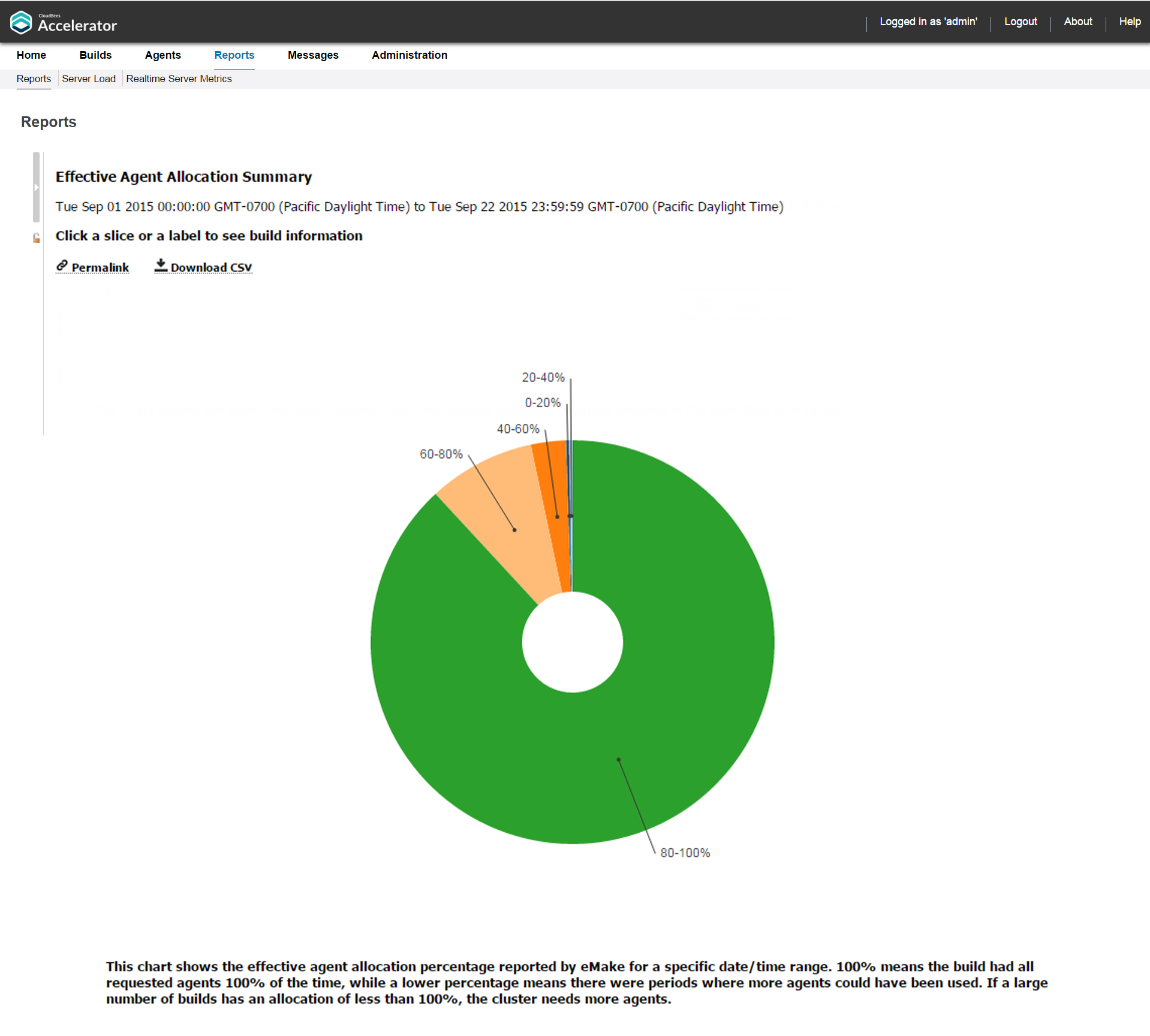
100% means the build had all requested agents 100% of the time, while a lower percentage means there were periods where more agents could have been used. The majority of your builds should be in the 90–100% range. If a large number of builds has an allocation of less than 100%, the Cluster needs more agents.
You can input either a build class or a build name along with a date range for this report. By default, the Ranges field contains: 0–20%,[0,20),20–40%,[20,40),40–60%,[40,60),60–80%,[60,80),80–100%,[80,100]. As a result, the default report displays the following allocation ranges respectively: 0–20%, 20–40%, 40–60%, 60–80%, and 80–100%.
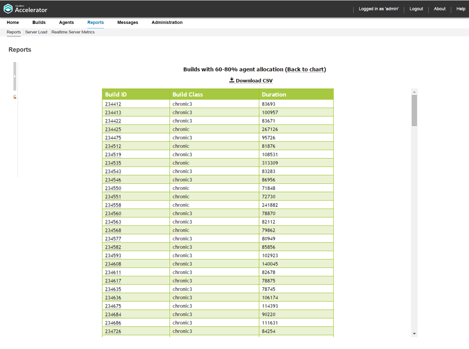
You can click a slice or a label to see build information:
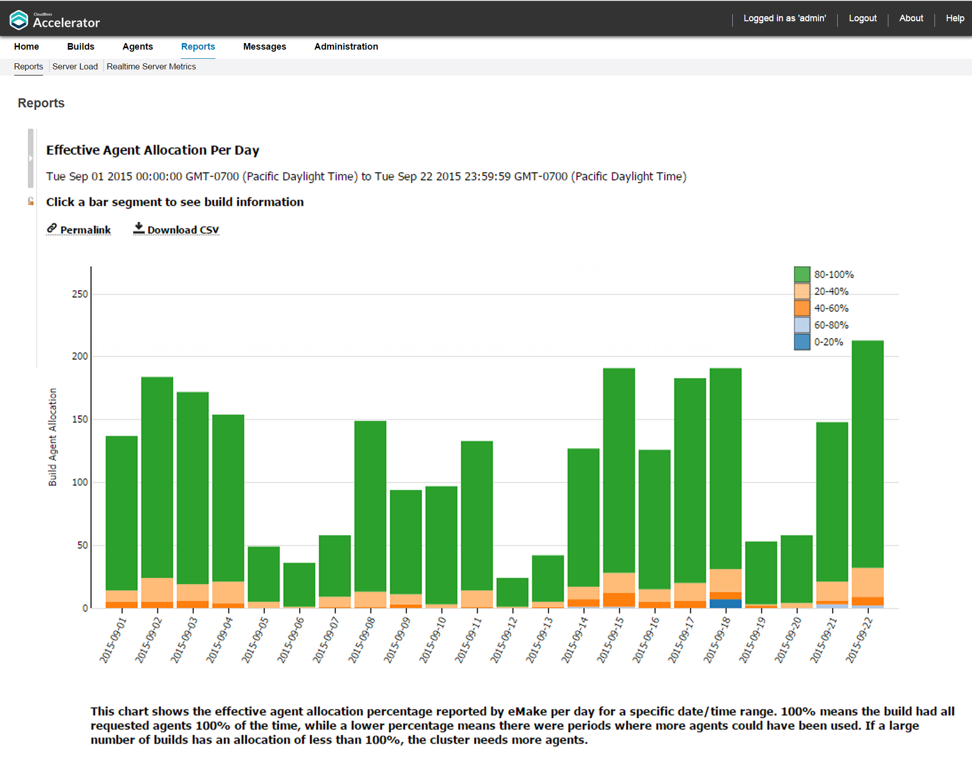
Effective Agent Allocation Per Day Report
This report is the same as the Effective Agent Allocation Summary report, except it is a stacked bar chart that shows agent allocation per day:
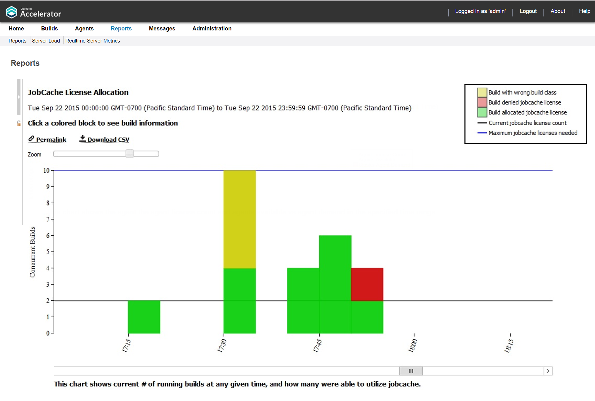
JobCache License Allocation Report
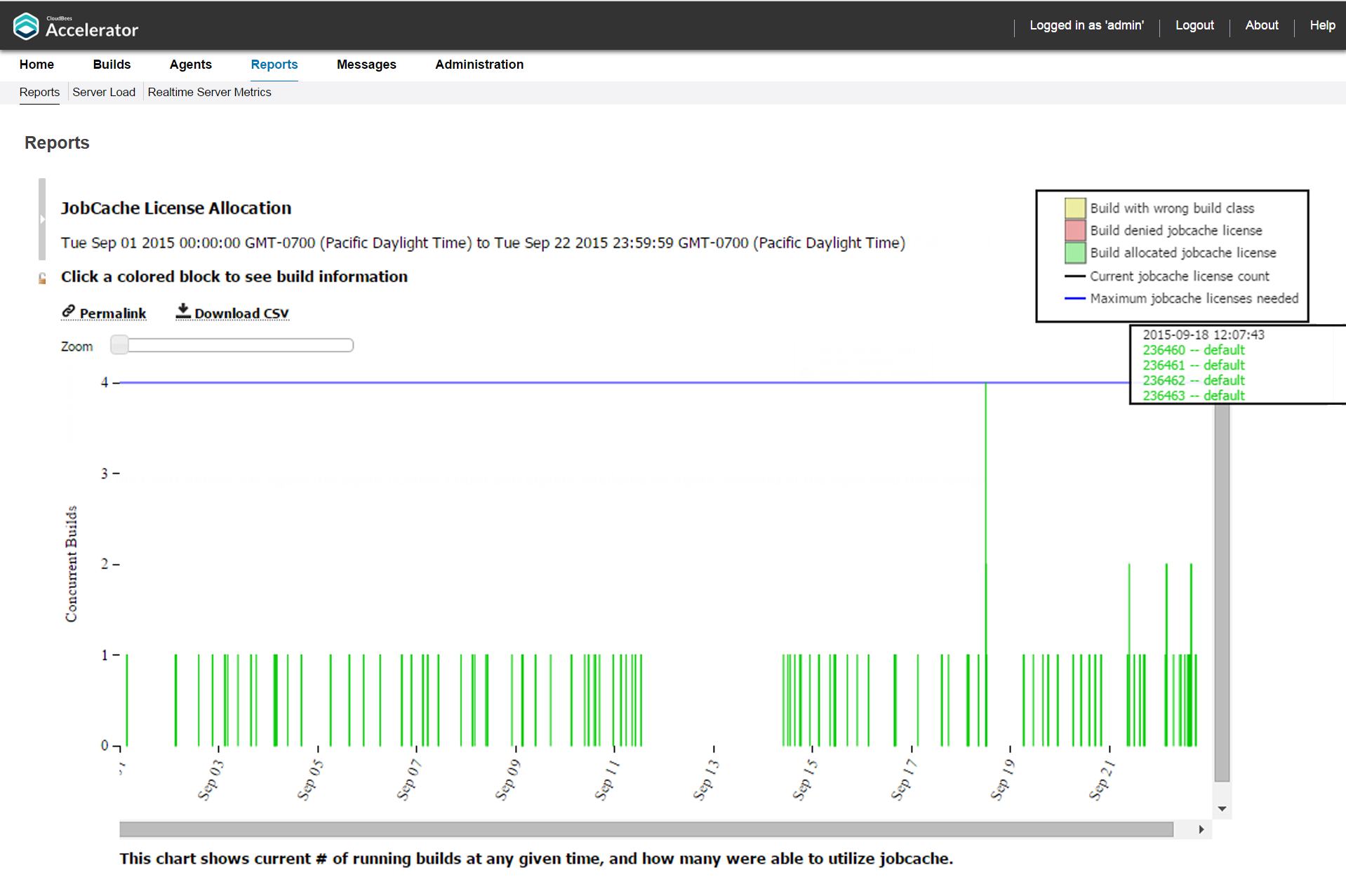
This report is a skyline chart that shows concurrent builds at any time, stacked by JobCache license request results, to show how many were able to use JobCache:
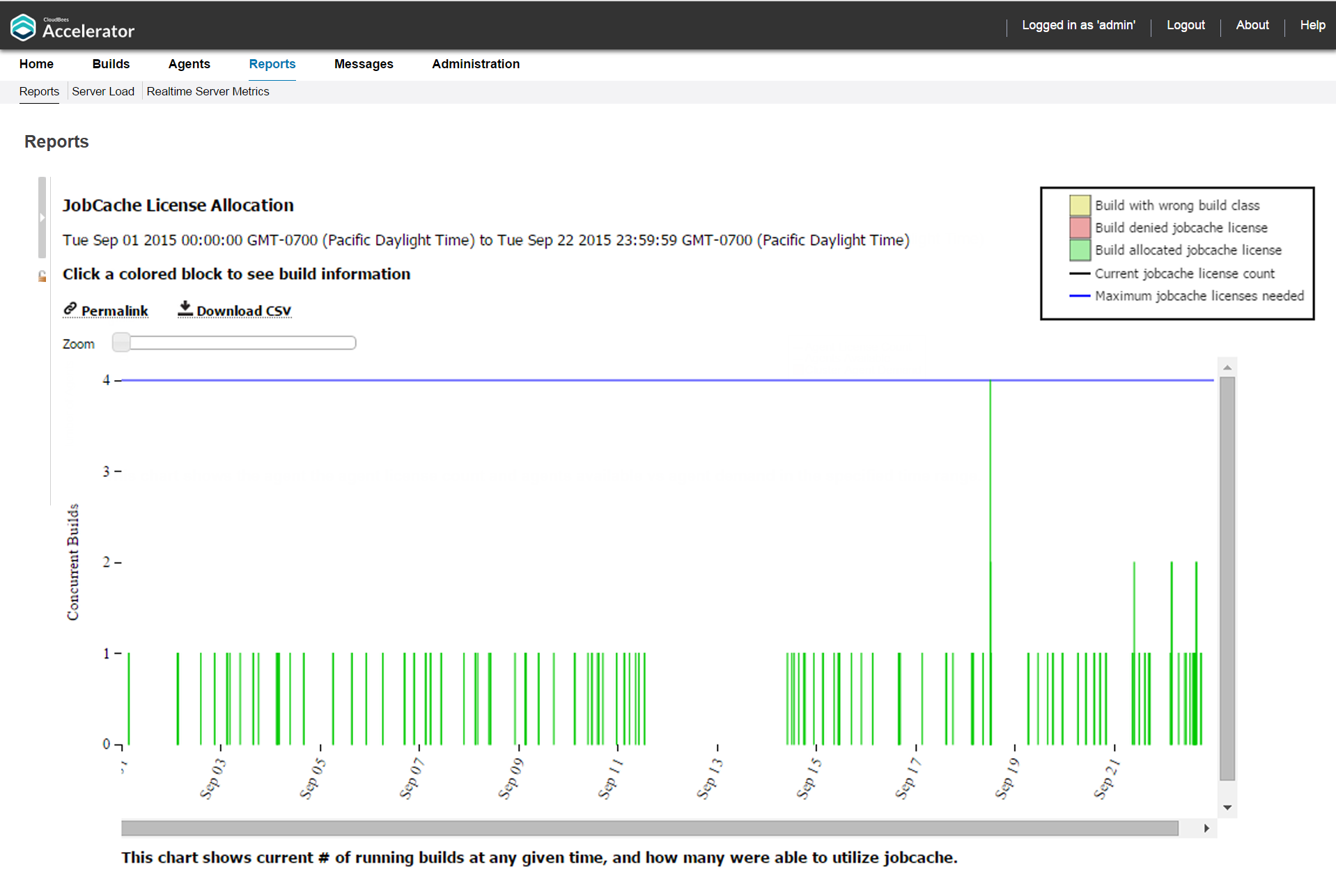
The chart includes two color-coded lines indicating the current JobCache license count and the maximum JobCache licenses needed.
You can input a build class or a build name. You can also specify a build duration threshold in which builds under that duration are not included in the report.
You can use the Zoom slider to zoom in to a particular stack or set of stacks:
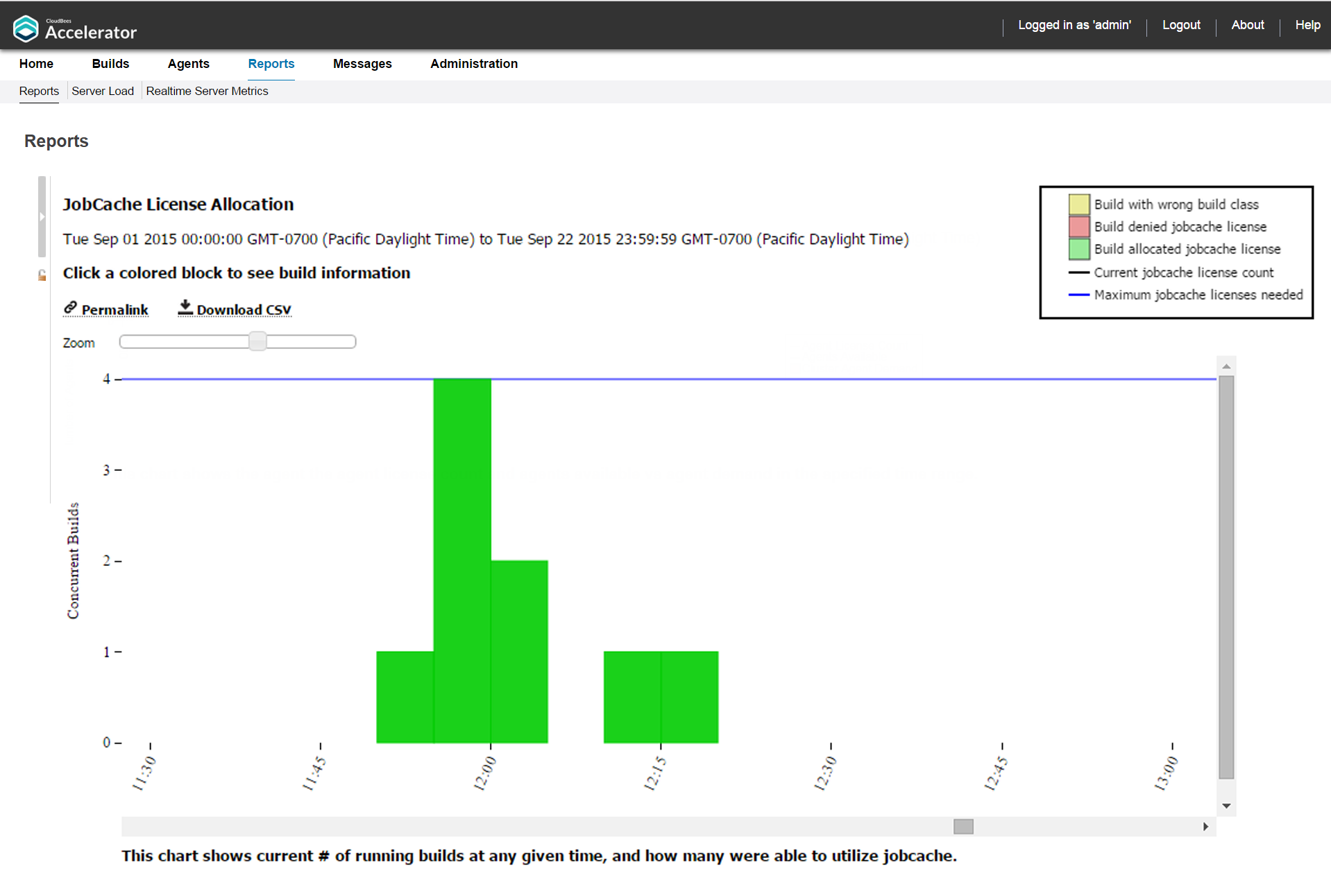
Each build is color coded to indicate whether the build was allocated or denied a JobCache license or was in a build class not enabled to use JobCache:
You can hover over a build event to see a list of builds in that stack:
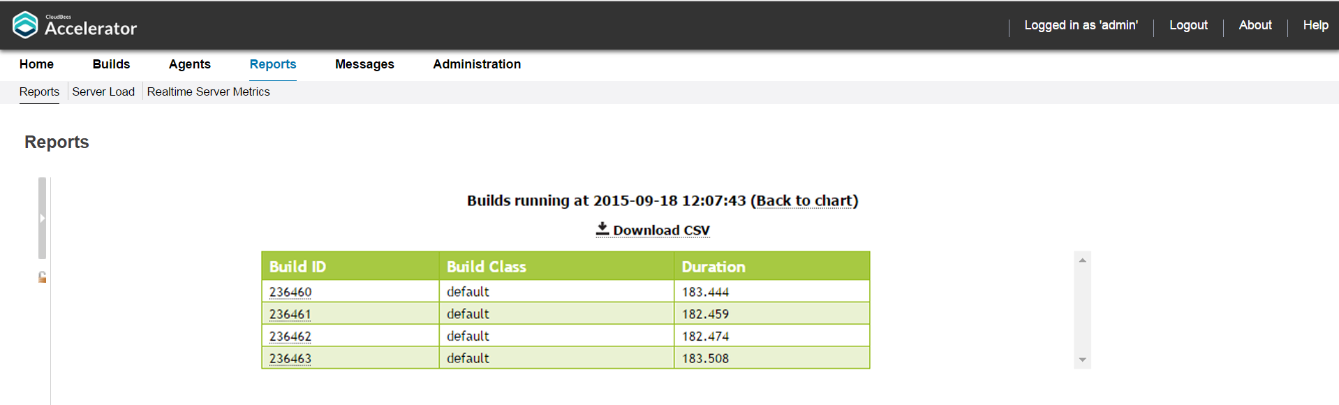
You can click a stack to see a table of builds for that build event:
JobCache Usage Summary Report
This report is several pie charts that show job cache requests and their results:
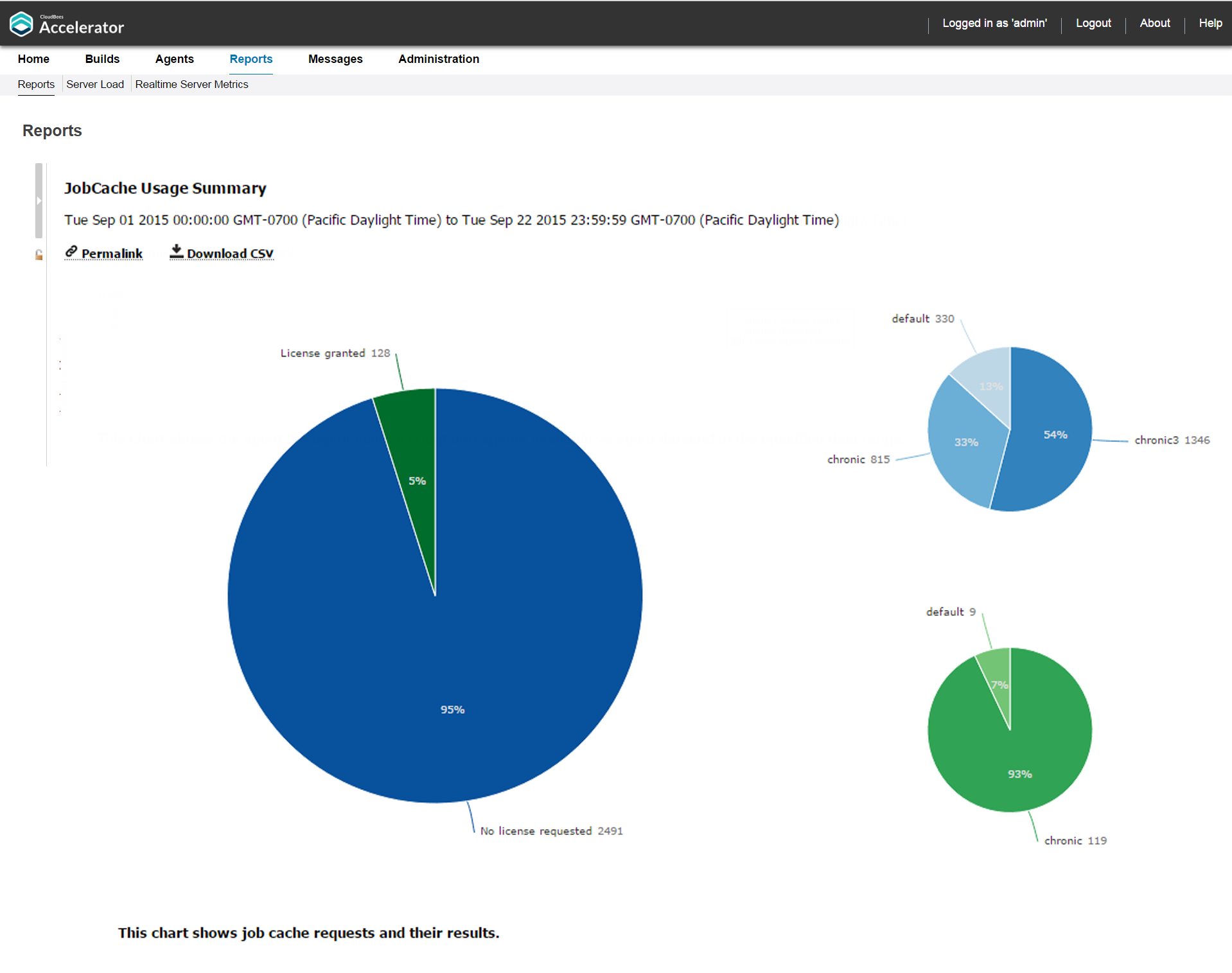
The large chart will have one to three segments (determined by actual JobCache usage). The large chart displays the percentages of builds that
-
Did not request a license.
-
Requested and were granted a license.
-
Were denied a license because of license limits or build class configuration.
Each small chart corresponds to a segment of the large chart and represents a breakdown based on build class.
Resource Usage over Time Report
This report is a chart that shows the peak number of simultaneous builds that ran on each resource over a specified time period:
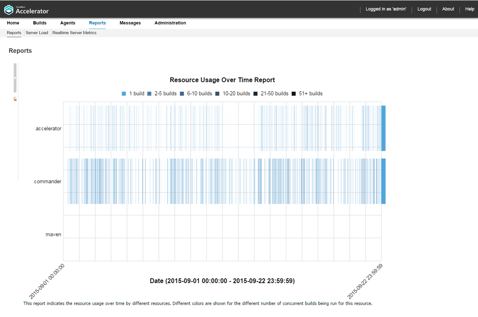
Each color represents the number of concurrent builds that are running for that resource.
Sea Level Report
This report is a plot of peak agent demand against a backdrop of projected Cluster sizes at or above 100%:
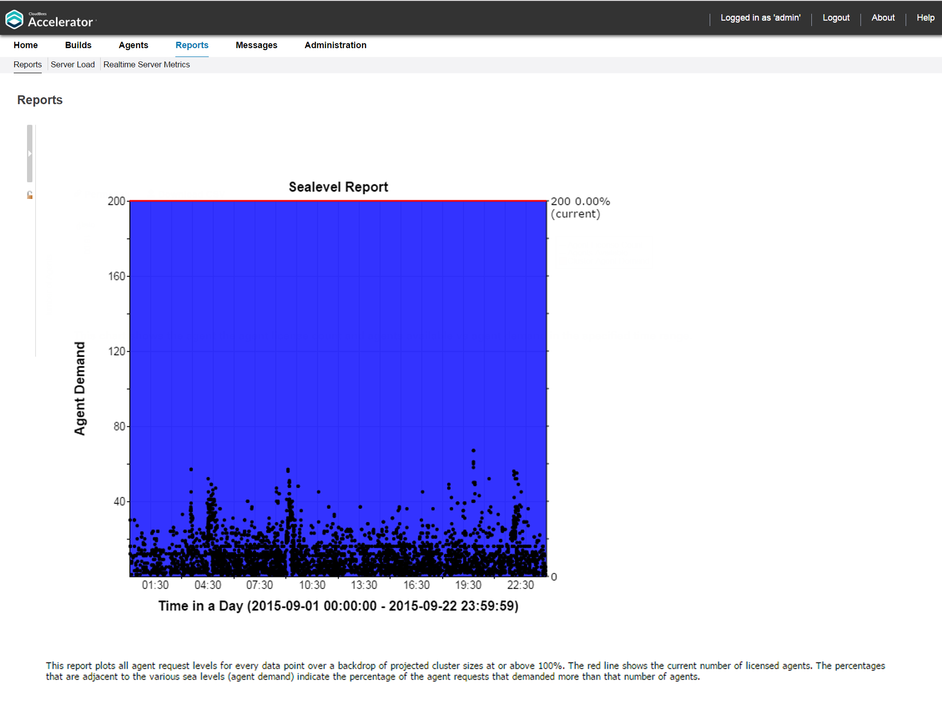
The red line shows the current number of licensed agents. The percentages that are adjacent to the various sea levels (agent demand) indicate the percentage of the agent requests that requested more than that number of agents.
To view this report, you must have “read” permission for resources and reports. For details, see Checking Your Permissions to Run Reports above. If you do not have “read” permission for both, reports are still available but the following popup appears: Error: AccessDenied: User <username> does not have the required ResourcesRead privileges to perform this operation.