Whether you are starting fresh in CloudBees CD/RO or learning a new concept, you can use the Hierarchy Menu to learn about the CloudBees CD/RO object model structure and product capabilities. This is a wizard-like menu that aids in application, microservice, and environment modeling in CloudBees CD/RO by helping you to visualize the relationships between objects in a project and coaching you along the way by indicating the next actions that are needed. This menu provides an easy-to-understand view of the model structure and where you are within it, highlights missing pieces, and streamlines navigation across objects.
The Hierarchy Menu is available in the Application Editor, the Microservice Editor, the Environment Editor, pipelines, and releases.
Viewing the Hierarchy Menu
To view the Hierarchy Menu for a project, open the Application Editor, the Microservice Editor, or the Environment Editor in that project. The Hierarchy Menu is expanded and visible by default. The following examples show the Hierarchy Menu:
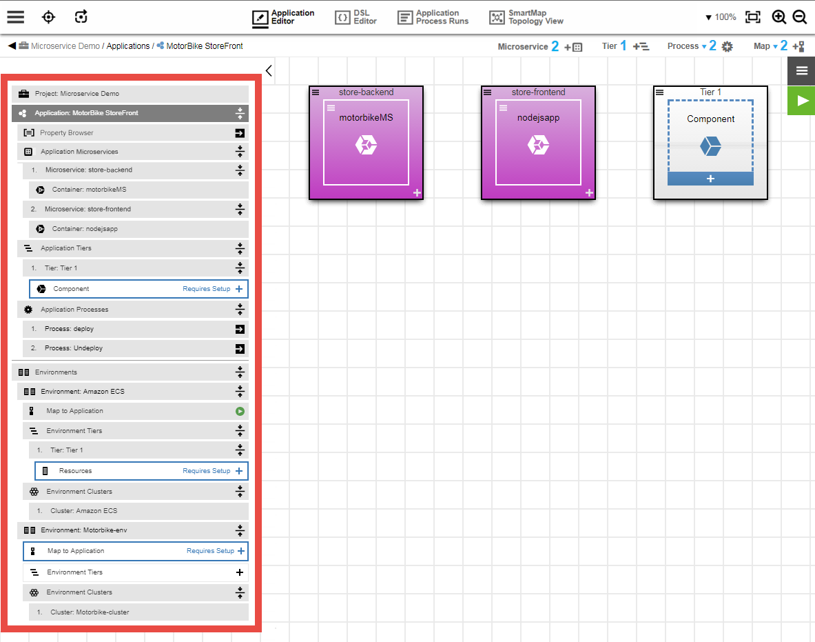
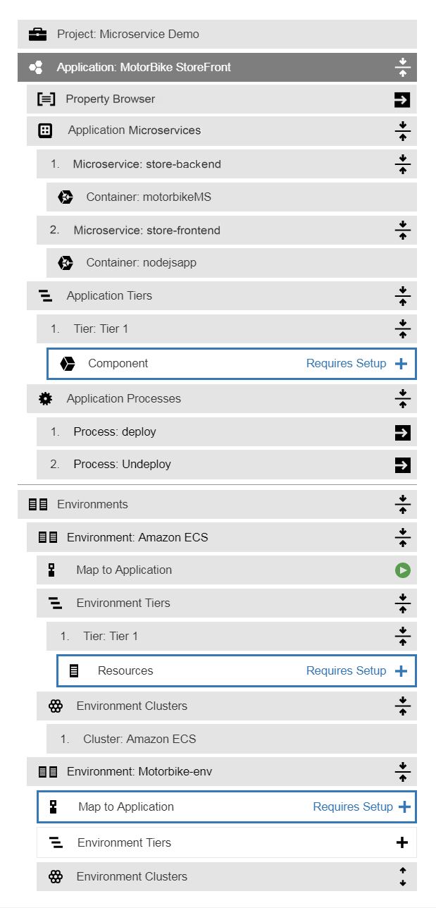
The content of the menu is dynamically updated whenever you create or edit an application, microservice, or environment. Child objects that are not yet set up do not have Actions enabled.
Certain Actions (such as clicking the  button) invoke popup dialog boxes. Each of these dialog boxes has modal behavior, which means that you must exit it before continuing.
Expand and Collapse Buttons
To collapse the menu, click the  (hide) button. To expand the menu, click the
  (show) button.
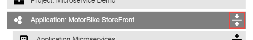
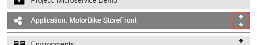
Every object with one or more child objects has a  (collapse) button or an
  (expand) button to collapse or expand the visibility of its child objects. The following example shows the button:
The following example shows the button:
Popover Menu
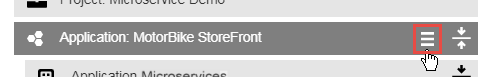
Some objects (rows) contain a  popover menu, which is visible only when you hover over the object. Following is an example of the menu button:
The following example shows the expanded menu after you click :
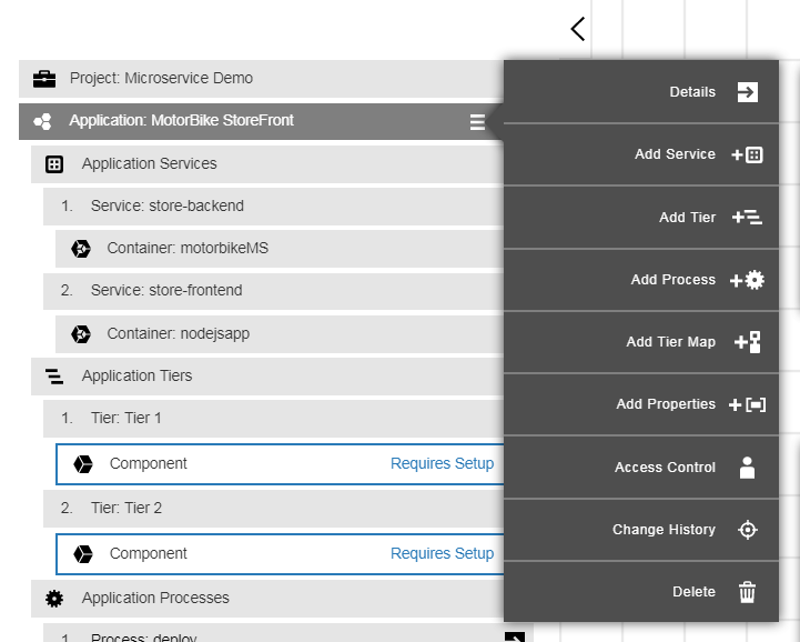
The menu provides all of the actions for that object that are available in the Visual Editor canvas for that object.
Add Button
Some objects (rows) have an  (add) button, which is visible only when you hover over the object:
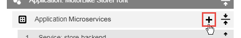
The button opens the dialog box to add an object.
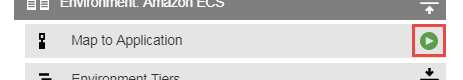
Visual Editor Button
If an object is editable in a Visual Editor, the  button appears next to it. The following example shows the button:
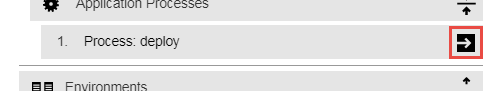
The button opens the Visual Editor for that object.
Requires Setup Button
If you have not completed the definition of an Application Component, Tier Map, or Environment Resources, the button appears for the object that needs to be defined . The following example shows the button for an Application Component that needs setup:
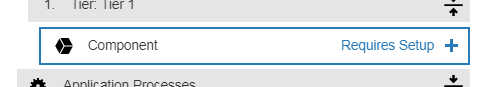
The button opens the dialog box for adding an Application Component.
The following example shows the button for a Tier Map that needs setup:
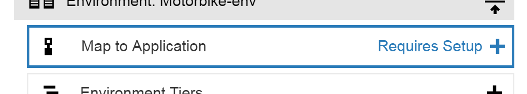
The button opens the dialog box for adding a Tier Map.
Application Run Button
The  (Application Run) button opens the application runtime settings dialog box, which you use to set up and start an application run. The following example shows the button:
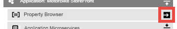
Property Browser Button
The (Property Browser) button lets you navigate properties more easily by allowing you view all properties on a hierarchy of objects in a project. The following example shows the button:
For details about this functionality, see Property Browser .