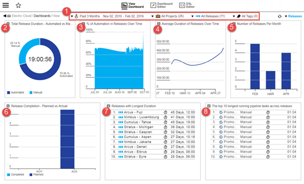
The Releases dashboard displays key metrics across releases that you can use to gain insight into your organization’s throughput and to bubble up any potential bottlenecks in your release delivery pipelines so that they can be addressed quickly. The metrics displayed by the Releases dashboard can be filtered by date, project, releases, and tags via the drop-down menus at the top of the dashboard.
| Where: | |
|---|---|
1 |
Filters–drop-down menus that let you filter by time period, project, release, and tags:
|
Visualizations |
|
2 |
Total Release Duration - Automated vs Manual Tasks % This chart shows the total time spent on releases (the number in the center ) and what percentage of that was spent on automated tasks versus manual tasks. This clearly points to your release efficiency by showing how much of the release time is being spent on manual tasks and the time savings you would achieve by automating more release processes. |
3 |
% of Automation in Releases Over Time This chart shows the progress in release process automation over time. This tells you how your organization is improving its application delivery and deployment processes across releases over time by adding more automation and reducing manual actions wherever possible. |
4 |
Average Duration of Releases Over Time This chart shows the trend for how long different releases took over time. It lets you visualize your organization’s throughput in terms of release efficiency over time. This helps you understand if you are spending less or more time on average for your releases. |
5 |
Number of Releases Per Month This chart shows the number of releases completed in the past several months, which lets you gauge the efficiency and throughput of your organization. |
6 |
Release Completion - Planned vs Actual This chart compares the planned completion dates against their actual completion dates. This lets you visualize how well your organization adheres to the plan. In case there are deviations, this report can help show any patterns when the deviations occur. |
7 |
Releases with Longest Duration This report lists the top ten releases that took the most time to complete. |
8 |
Top 10 Longest Running Pipeline Tasks across Releases This report lists the top ten pipeline tasks that were run in the context of releases that took the most time to complete. This report helps find certain tasks (especially manual tasks) that need attention to improve your ability to deliver faster and on time. You can drill down into the Top 10 Longest Running Pipeline Tasks Across Releases cell by clicking a pipeline task. The Pipeline Run Details page appears and shows an expanded view of the pipeline run that includes the task. |