Parameters are user-defined and used throughout the deployment planning and management process. You can define both input and output parameters in place of predefined credentials, property paths, user or group names for notifications, runtime conditions.
These objects support parameters:
-
Pipelines and their tasks
-
Application processes and components
-
Microservice processes
-
Master Components
-
Service catalog items
-
Dashboards
-
Reports
The sections below show how to create and manage parameters on a pipeline object. However, the process is the same for any supported object.
Viewing Parameters
To view the parameters currently defined for the object, navigate to the object-specific editor. The pipeline editor is shown here.
Click  on the upper right corner of the editor and select Parameters: the Parameters dialog opens.
Adding Parameters
Navigate to the object-specific editor. This steps below showcase the pipeline editor. Click on the upper right corner of the editor and select Parameters: the Parameters dialog opens.
-
Click Add, or if no parameters have not yet defined for the object, click There are no Parameters yet. Add one + to add a parameter: the New Parameter dialog box opens.
-
Enter the following information. In addition to the information below, several input fields have tool tips, denoted with
 , with additional information to help you. Click OK when finished with the parameter definition.
Field Name Description Name
A unique name for the parameter.
Description
(Optional) Plain text or HTML description for this object. If using HTML, you must surround your text with
<html> … </html>tags. Allowable HTML tags are<a>,<b>,<br>,<div>,<dl>,<font>,<i>,<li>,<ol>,<p>,<pre>,<span>,<style>,<table>,<tc>,<td>,<th>,<tr>, and<ul>.For example, the following HTML:
<p>
<span style="font-family: Arial;">
  <i>Note:</i> For more information about the <b>abc</b> object, see
         <a href="https://www.google.com/">\https://www.google.com</a>.
</span>
</p>
renders as follows:
<i>Note</i>: For more information about the <b>abc</b> object, see \https://www.google.com.This description renders as a tool tip for the parameter at object runtime.
You can include hyperlinks as part of an object description for any CloudBees CD object. Label
(Optional) The label for this parameter as it appears on the parameters panel at object runtime.
Parameter Type
Select the parameter type from the drop-down menu. The following types are available.
Application
Creates an Application drop down to select an application object. In order to use this parameter type, you need to first provide a way for the user to select the application’s project via a Project, Dropdown Menu, or Text Entry parameter.
Note: not available for Dashboard or Report objects.
Checkbox
Creates a checkbox for a value to select (or not) when the parameter is presented.
-
Value when unchecked —The value of the parameter when the checkbox is unchecked.
-
Value when checked —The value of the checkbox when the checkbox is selected.
Credential
Selecting this option requires the user to specify a user name and password to use this parameter at runtime.
Note: not available for Dashboard or Report objects.
Date
Allows for a date value to be selected using a date chooser. The selected date value is in ISO 8601 yyyy-MM-dd .
Dropdown Menu
Creates a drop-down menu from which to select a value when the parameter is presented.
-
Enter options —Click Add Option + to add a new row. Type-in the text and value for each option. The text is what will be displayed in the menu, and the value is the parameter value if that option is selected.
-
Load options from list —Enter a pipe-separated list of options (for example,
foo|bar|baz). The text and value for the options will be the same. -
Load Options from Properties —Enter the path to property sheet that contains options for the parameter. This selection has two choices.
-
Load options using fixed structure:
The options to display for the Parameter are determined using the following properties that must exist within the property sheet.
optionCount=<Number of available options, e.g., 3> option1/ text=<Text to display> value=<Parameter value to use> option2/ text=<Text to display> value=<Parameter value to use> ...and so on till optionN/ text=<Text to display> value=<Parameter value to use>-
Options from a property sheet:
Example 1: If the Property Sheet contains the following Properties:
Version7=7.0 Version8=8.0 Version9=9.2 ...then the following options will automatically be displayed using the Property name as the text to display and the Property value as the Parametervalue to use. Version7 Version8 Version9Example 2: If the Property Sheet contains the following nested Property Sheets:
Version7/ Version8/ Version9/ ...then the following options will automatically be displayed using the Property Sheet name as both the text to display as well as the Parameter value to use. Version7 Version8 Version9-
Load options using DSL —Enter a DSL script that allows for dynamically populating the drop-down menu. Click the tooltip icon
for this selection to see an example. Additional examples are available in the CloudBees CD API Guide at Using the CloudBees CD DSL.
Environment
Creates an Environment drop down to select an environment object. In order to use this parameter type, you need to first provide a way for the user to select the object’s project via a Project, Dropdown Menu, or Text Entry parameter.
Note: not available for Dashboard or Report objects.
Header
Used to render a heading. When rendered, this header is positioned before one or more parameters based on its position in the parameter list. There is no other explicit association with other parameters.
Integer
Allows for an integer value.
Microservice
Creates a Microservice drop down to select an microservice object. In order to use this parameter type, you need to first provide a way for the user to select the object’s project via a Project, Dropdown Menu, or Text Entry parameter.
Note: not available for Dashboard or Report objects.
Pipeline
Creates a Pipeline drop down to select an pipeline object. In order to use this parameter type, you need to first provide a way for the user to select the object’s project via a Project, Dropdown Menu, or Text Entry parameter.
This is not available for Dashboard or Report objects.
Project
Creates a Project drop down to select a project name.
Radio Selector
Creates "radio" buttons to select an entry when the parameter is presented.
-
Enter options —Click + Add Option to add a new row. Type-in the text and value for each option. The text is what will be displayed in the menu, and the value is the parameter value if that option is selected.
-
Load options from list —Enter a pipe-separated list of options (for example,
foo|bar|baz). The text and value for the options will be the same. -
Load options from property sheet —Enter the path to property sheet that contains options for the parameter. The property sheet must be created in a specific format:
-
An
optionCountproperty must exist whose value is the number of options. -
For each option, create a nested property sheet called
optionN, where N is the option number, starting with1. -
In each nested sheet, create two properties—
textandvalue. The value of the propertytextwill be displayed in the menu. The value of the propertyvalueis the parameter value if that option is selected. -
If
optionCountis set to3, you must create three nested sheets—option1,option2, andoption3.
Release
Creates a Release drop down to select an release object. In order to use this parameter type, you need to first provide a way for the user to select the object’s project via a Project, Dropdown Menu, or Text Entry parameter.
Note: not available for Dashboard or Report objects.
Text Area
Allows for a longer text entry.
Text Entry
Allows for a short text entry.
Default Value
Default value to assign to the parameter if no explicit value is provided.
Required
Click the checkbox to select the parameter as required. A value must be provided for the parameter if it is required.
Defer Expansion
Determines whether to defer parameter value expansion when the parameter value contains $[].
-
If unchecked (default), expansion is not deferred and is done at the time the parameter value is passed to the process, procedure, task, and so on, depending on where the parameter was defined.
-
If checked, expansion is deferred and occurs when the process step, procedure step, and so on, executes.
Custom Validation
Provides run-time validation on parameters via a user-supplied DSL script. If selected, the Custom Validation dialog displays, allowing you to supply the validation DSL script.
If left empty, no validation occurs.
Click the tooltip icon
for this selection on the New Input Parameter dialog to see examples.Render Condition
Render this parameter based on the condition of another parameter. For example, render this parameter if
anotherparamequals10.If left empty, this parameter renders by default.
Click the tooltip icon
for this selection to see examples.Dependencies
One or more formal parameters on which this parameter depends on for custom validations or for rendering drop-down options using DSL. For an example, see the "createFormalParameter" section of the CloudBees CD API Guide on this page: Parameter Management.
If left empty, this parameter renders by default.
-
Custom Validation Examples
Example 1
DSL script example for custom validation logic.
// Apply your custom validation logic if (args.parameters['paramName1'] != 'test1' && args.parameters['paramName1'] != 'test2') { // return an appropriate error message in case the validation failed return "'paramName1' parameter value is not valid" } else { // an empty or null response is construed as a validation success return null }
Example 2
Here is a DSL script example for custom validation logic that depends on another parameter. Note that for custom validation logic that depends on another parameter, you also need to declare a dependency on the formal parameter that the validation logic depends on.
// Get the formal parameter that the validation logic for this parameter depends on. def selectedValue = args.parameters['country'] // Note: You also need to declare a dependency on 'country' formal parameter // from this formal parameter to enable the UI to trigger a validation for // this formal parameter whenever the 'country' formal parameter value is // changed by the user. if (selectedValue == 'US') { if (args.parameters['paramName1'] != 'CA' && args.parameters['paramName1'] != 'CO') { // return an appropriate error message in case the validation failed return "'paramName1' parameter value is not valid for selected 'country'" } } else if (selectedValue == 'Canada') { if (args.parameters['paramName1'] != 'BC' && args.parameters['paramName1'] != 'ON') { // return an appropriate error message in case the validation failed return "'paramName1' parameter value is not valid for selected 'country'" } } // Return an empty string or null to indicate validation success return null
Render Condition Examples
Here are some render condition examples for parameter, param2. In these examples, param1 ` is the driving parameter for rendering `param2.
-
${param1} == '123'Renderparam2 ` only if param1 is set to `123. -
${param1} == '123' AND ${param2} == 1Renderparam2 ` only if param1 is set to `123 ` and `param2 ` is set to `1. -
${param1} != '456' OR ${param3} == '123''This example has two driving parameters. Renderparam2 ` only if `param1 ` is not set to `456 ` or `param3 ` is set to `123.
Modifying Parameters and Parameter Labels
To modify a parameter for a given object, navigate to the object-specific editor. The pipeline editor is shown here.
-
Click
on the upper right corner of the editor and select Parameters: the Parameters dialog opens. -
Locate the parameter you wish to modify from the list and click its edit object icon
 . The parameter editor opens.
 -
Make desired changes, using information about field definitions from Adding Custom Parameters .
-
When finished, click OK to save your changes.
Rendered Parameters at Runtime
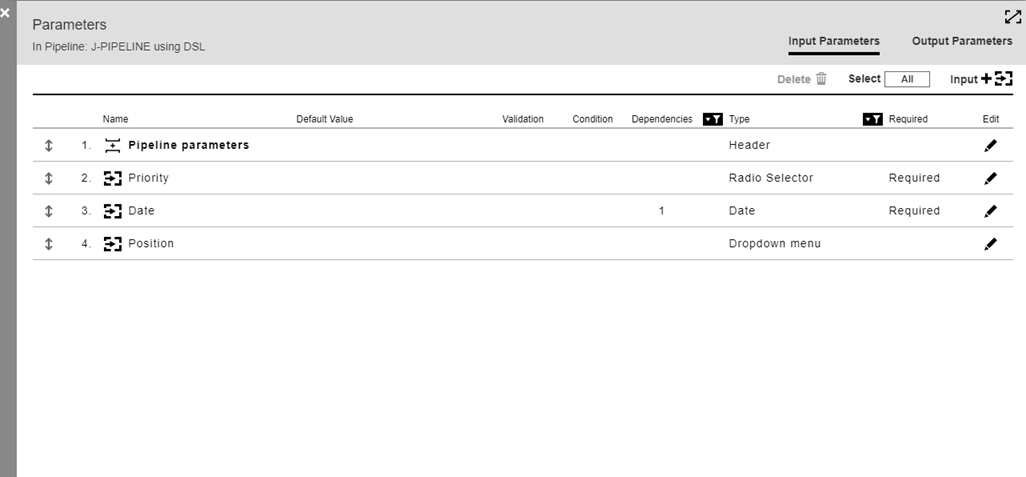
Here is the parameter list that defines several parameters for J-PIPELINE.
When a new pipeline run is started, the rendered panel for these parameters displays.
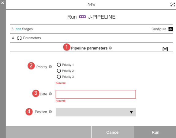
There are four parameters corresponding to the four on the parameter list for this pipeline. Each one has a tool tip whose contents is populated from the description in the parameter definition.
1 |
The header type parameter. |
2 |
Radio selector type parameter. The three radio button choices are displayed, along with the Required notation. |
3 |
Date type parameter. This parameter has a dependence on parameter #2. Clicking the value box brings up a date chooser. It is noted as Required. |
4 |
Dropdown menu type parameter. Clicking the drop-down arrow expands the list. |