The Application Deployments dashboard displays key metrics for application deployments that can be used to gain insight into your organization’s throughput and to bubble up any potential bottlenecks in your application deployment processes so that they can be addressed quickly. The Application Deployments dashboard provides indicators to measure agility of development and reliability of application deployments. This dashboard does not include microservice deployments.
| Where: | |
|---|---|
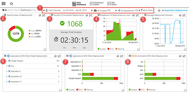
1 |
Filters–drop-down menus that let you filter by time period, project, release, and tags:
|
Visualizations |
|
2 |
Total Number of Deployments This chart provides a breakdown of all the application deployments by their outcome, which lets you measure the reliability of your application deployments. You can drill down into the Total Number of Deployments cell by clicking a slice or clicking on the legend (useful if the slice is too small to click on). The application deployments for the outcome in the selected slice appear on the Application Deployments page. For example, if you click on Error, only the failed deployments are listed in the Application Deployments page. Examples of possible outcomes are Success, Error, Warning, and Aborted. |
3 |
Number of Successful Deployments This chart provides two powerful metrics as measures of your application deployment’s health and efficiency: the total number of successful application deployments and their average deployment time. |
4 |
Breakdown of Deployments by Outcome Over Time This chart shows you the application deployment trend over time. You can use it to gauge the efficiency of your organization in delivering applications and features over time. You can drill down into the Breakdown of Deployments by Outcome Over Time cell by clicking and dragging to select a date range. The application deployments for the selected date range appear on the Application Deployments page. |
5 |
Average Deployment Duration This chart shows the average duration of successful application deployments over time. This lets you see whether your organization’s application deployment efficiency is improving over time. You can drill down into the Average Deployment Duration cell by clicking and dragging to select a date range: the application deployments for the selected date range appear on the Application Deployments page. |
6 |
Applications With Most Failed Deployments This report lists the applications with the largest number of failed deployments. The list is limited to five applications, which lets you focus on application teams that might need the most help. You can drill down into the Applications With Most Failed Deployments cell by clicking an application. The Application Deployments page shows the failed deployments for the selected application. |
7 |
Applications With Most Deployments This chart shows the top applications with the most deployments with a breakdown by deployment outcome. The information in this report along with the earlier “Applications With Most Failed Deployments” report lets you gain insight into the productivity of different application teams along with the reliability of delivery. You can drill down into the Applications With Most Deployments cell by clicking an application. The Application Deployments page shows the deployment breakdown based on the selected application and deployment outcome. |
8 |
Environments With Most Deployments This chart shows the environments with the most application deployments with a breakdown by deployment outcome. This presents information similar to the Applications With Most Deployments report except it uses the application deployment environments dimension. You can drill down into thecell by clicking an environment. The Application Deployments page shows the deployments based on the selected application and deployment outcome. |