You select a project to contain the dashboard, name the dashboard, and add one or more widgets, which displays the kinds of data that you select. You can also add input parameters to a dashboard.
You can create a widget or copy a widget from an existing one for placement in a dashboard. For example, you might want to create a new dashboard consisting of a custom widget, two widgets from one dashboard, and two widgets from a second dashboard.
The Dashboards List
To open the Dashboards list, click the Flow main menu and then click Dashboards in the DevOps Analytics column of the Deploy UI. The Dashboards list opens.
The Dashboards list shows all of the DevOps Insight dashboards that are available in the currently-selected project or projects. For example, the following Dashboards list shows the reports in a project named “Electric Cloud:”
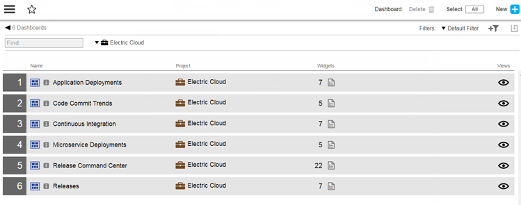
To open the Dashboards list, click the Flow main menu and then click Dashboards in the DevOps Analytics column of the Deploy UI. It comprises dashboards included, out-of-the-box, with CloudBees Flow and as well as custom dashboards that you have created. By default, the dashboards are listed for all projects. You can filter this list by any combination of projects via the projects menu.
CloudBees Flow dashboards can help you learn about the dashboard functionality and can serve as models to create your own dashboards. You can also make copies of these dashboards to use as templates for creating dashboards. These dashboards are in the `Electric Cloud ` project and are not editable.
| If you have customized the Release Command Center dashboard, your customization appears separately in this list and is marked with an identifying asterisk ( Release Command Center * ) in addition to the stock dashboard in the list. However, in the Release Editor, only one instance of the Release Command Center dashboard is displayed (either the out-of-the-box version or the customized version if it exists). Precedence is given to the customized version of the Release Command Center dashboard if you have created one. If a customized version does not exist, the out-of-the-box Release Command Center dashboard is loaded. |
The Views button provides quick access to the Dashboard Editor for a specific dashboard:
Naming a Dashboard and Assigning it to a Project
-
Click the new button to create a new DevOps Insight dashboard or report. The New Dashboard dialog box appears.
-
Click Create New….
-
Enter the following details:
-
Name —Name of the dashboard to create
You should avoid using special characters, which are described in "Using Special Characters in CloudBees Flow Object Names" in the CloudBees Flow User Guide .
-
Select Project —The project in CloudBees Flow to which this dashboard will belong
-
(Optional) Description —Description of the dashboard
-
Dashboard Type —Type of dashboard to create
-
Standard —Non command-center dashboard such as Releases, Application Deployments, Microservice Deployments, Continuous Integration, or Code Commit Trends dashboard
-
Command Center —Command center type of dashboard
This dashboard type has a special grid- and column-based layout. The Release Command Center, which is shipped with CloudBees Flow, is a well-known example of this dashboard type.
-
-
-
Click OK. One of the following appears depending on your dashboard selection:
-
Dashboard Editor —The new dashboard appears in the Dashboard Editor
-
Command Center —For creating the first column for the new dashboard
-
-
Proceed to either Configuring Command-center Dashboards or Configuring Standard Dashboards.
Configuring Command-center Dashboards
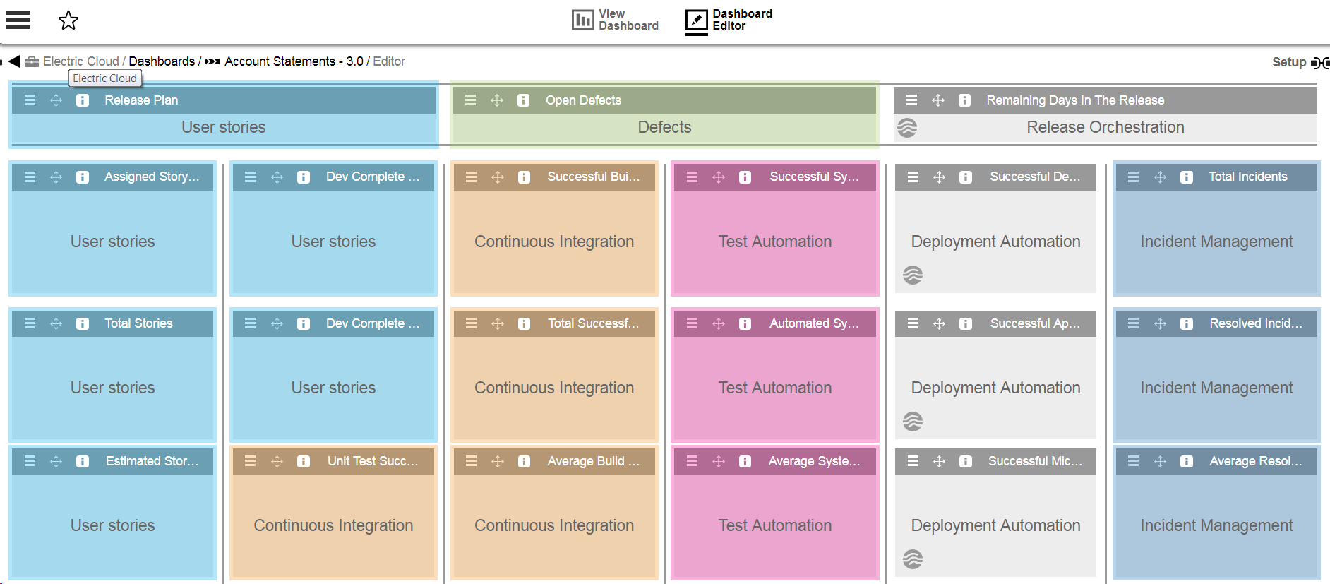
To create a cell in a command-center style of dashboard, you define its underlying widget. You can add, remove, or alter widgets for command center dashboards.
You can add or update columns for a command center type of dashboard using the dashboard editor. Also, you can add widgets that show metrics for any report object type, such as build or code-commit. The Release Command Center editor displays the widgets in different colors based on the object type of the backing report. In the example below, the User Stories widgets appear in blue, while the Test Automation widgets are displayed in pink:
-
Fill in the dialog box for creating the first column for the new dashboard as follows:
-
In the Name field, enter a name for the new column and click OK. The new column appears in the dashboard. For example
-
Click the New Widget button to add a widget to a column and click Create New. The Edit Widget Details dialog box for creating the first widget for the new dashboard appears. Supply details as shown in the table below.
Menu or Field Description Name
Name of the widget to create.
Description
(Optional) Description of the new widget.
Place into…
Header or column in which to add the new widget. Click Header or Column (the default), and then select the specific header or column.
Widget position
Location of the new widget in relation to another widget (if one already exists) that you choose via the Select Widget pulldown menu. You can ignore this setting if this is the first widget, because the menu is not yet populated with values. If there are existing widgets, you can select one of them from the menu.
Add Another
Button that opens a dialog box to let you add another widget “on the fly” without exiting the Edit Widget Details dialog box. This button lets you quickly populate a dashboard with numerous widgets.
Define
Button for opening the Edit Widget dialog box (described below).
Done
Button that saves the changes that you made in the Edit Widget Details dialog box.
-
Complete the dialog box as described above, and then click Define. The Edit Widget Definition dialog box for the new widget appears. The Details tab is prepopulated with the widget name and details that you previously entered, but you can modify them here if desired.
-
Click the Definition tab.
The Definition tab lets you enter the widget definition details such as the backing report and input parameters to use.
Menu or Field Description Widget Title
Title to be displayed on top of the widget in the dashboard UI.
Filter by Project
Limits the selection of reports and input parameters to a specific project.
Report
(Optional) Report used by the widget to retrieve data for visualization from the DevOps Insight server.
For details about creating reports, see Creating a DevOps Insight Report .
You can click the Report Preview tab to see sample output based on the report you selected. For example: image::user-guide/insight-creat-widg-dialg17.png[] Input Parameters
Free-form input values that can be fed to a dashboard or report to “slice and dice” the data based on the parameter value. For example, metrics and trends over the last 10 days.
-
Complete the fields in the Definition tab as needed.
-
Click the Visualization tab.
The Visualization tab lets you set up the type of visualization to use for rendering the data returned by the widget’s backing report. The Select Visualization pulldown menu provides a variety of widget visualizations such as Area Chart, Donut Chart, and Metric.
Menu or Field Description Visualization Settings
Visualization
Image that previews the actual rendering of the widget as it will appear in the dashboard
Display Trend Arrow
Determines whether to display a trend indicator arrow, which shows the general direction of an already-formed trend:
Trend Value
(Available only if Display Trend Arrow is checked) Select this checkbox to display the trend column value next to the trend indicator arrow. From the Display Trend Value as menu that appears, you must select Number or Percent
Display icons using
Icon to display along with the metric value.
Metric Settings
Select Type
The choices are Single or Total.
Select Column
Column in which to place the widget.
Select “Total” Column
Field containing the total value on which the metric value is based. If set, this field appears along with the metric value as metric_value of total_value.
For example, 7 of 10 Planning Complete.
Display Metric as
Type of unit for the metric. Valid values are None, Number, Duration, or Percent
Trend Settings
Select Trend Column
Field to contain the trend value. If defined, it determines the direction for the trend indicator arrow on the widget
-
Complete the Visualization tab as described above, and then click the Report Preview tab.
This tab lets you preview the results of the report used by the widget to retrieve data for visualization from the DevOps Insight server. It lets you see the report data as you are defining the widget to know which columns to choose but is not meant as a preview for what will be saved.
-
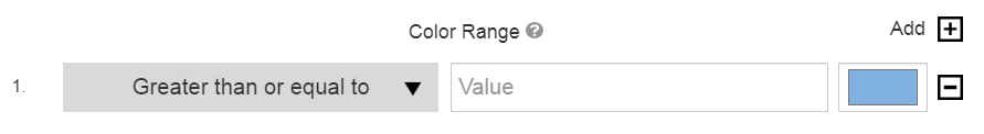
Click the Color Map tab.
This tab lets you enter the range of background colors corresponding to metric column values.
Menu or Field Description Color Range
List of color ranges that are already specified.
Add
Color code for a specific range of values. For example, RGB 195, 232, 247 (light blue) for values greater than or equal to 90.
The possible values are Greater than or equal to, Less than, or Between.
-
Complete the Color Map tab as described above, and then click the Drill-Down tab. This tab lets you drill down into certain widgets in the columns for more information.
Menu or Field Description Target
Target page to navigate to when the user drills down from the widget. You can select Deployments, Microservice Deployments, External, Releases, or Pipeline Runs
-
Complete the fields and menu options in the Drill-down tab as follows. The exact set of menu options or fields in this section varies with the type of target that you select from the Target pull-down.
Menu or Field Description, where more than field name is available) Target
Page to navigate to when you drill down through the dashboard widget
External URL
External URL to navigate to
Release Actual End Date Range - Minimum
Minimum actual end date and time for the release
Release Actual End Date Range - Maximum
Maximum actual end date and time for the release
Release Planned End Date Range - Minimum
Minimum planned end date and time for the release
Release Planned End Date Range - Maximum
Maximum planned end date and time for the release
Path to the Pipeline Task
Field containing the '/' separated path to the pipeline task. For example,
group1/parentTask1/task1Each of these fields represents a field or column from the corresponding report definition that you created above. For example, in the Application Name field, you could enter
${applicationName}, whereapplicationNameis a column in the report definition that you created in the Report section above.Also, for example, in the *External URL* field, you could enter `${drilldown_base_url}^incident_state=6^ORincident_state=7`, where `drilldown_base_url` is a column in the report definition that you created in the *Report* section above. . Click *OK* to save your changes. . (Optional) Rearrange the widgets or columns in the new dashboard.You can click and drag a widget to move it from any part of the dashboard to a different part (section, column, or simply rearrange the order in a column).
You can also delete an entire column by clicking by choosing Delete from the column’s menu:
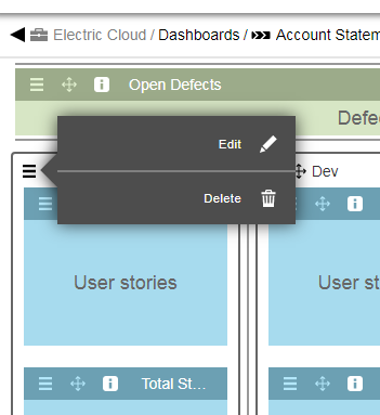
You can choose to move the deleted column’s widgets to another column rather than deleting them altogether.
Configuring standard dashboards
To create a cell, you define its underlying widget.
-
Click the New Widget button to add a widget to a column and click Create New *. A dialog box for creating the first widget for the new dashboard appears.
-
In the dialog box for creating the first widget for the new dashboard, enter a name for the widget and then click Define.
The Edit Widget <widget_name> dialog box for the new widget appears. You can change the name of the widget (in the Widget Name field) in this dialog box and also add a description of the widget (in the Description field). Both of these fields are optional at this time, and you can change them later.
-
Click the Definition tab.
The Definition tab lets you enter the widget definition details such as the backing report and input parameters to use.
| Menu or Field | Description |
|---|---|
Widget Title |
Title to be displayed on top of the widget in the dashboard UI. |
Filter by Project |
Limits the selection of reports and input parameters to a specific project. |
Report |
(Optional) Report used by the widget to retrieve data for visualization from the DevOps Insight server. For details about creating reports, see Creating a DevOps Insight Report . TIP: You can click the Report Preview tab to see sample output based on the report you selected. |
Input Parameters |
Free-form input values that can be fed to a dashboard or report to “slice and dice” the data based on the parameter value. For example, metrics and trends over the last 10 days. |
-
Complete the fields in the Definition tab as needed.
-
Click the Visualization tab. The Visualization tab lets you set up the type of visualization to use for rendering the data returned by the widget’s backing report. The Select Visualization pulldown menu provides a variety of widget visualizations such as Area Chart, Donut Chart, and Metric.
Menu or Field Description Visualization Settings
Visualization
Image that previews the actual rendering of the widget as it will appear in the dashboard
Display Trend Arrow
Used to render a trend indicator arrow, which is based on the value of a report column that represents the trend. This arrow shows the general direction of an already-formed trend (meaning whether the numbers are going up or down over time)
Trend Value
(Available only if Display Trend Arrow is checked) Select this checkbox to display the actual trend value below the trend indicator arrow. This value is from a report column that represents the trend (whether the numbers are going up or down over time).
From the Display Trend Value as pulldown menu that appears, you must select Number or Percent :
Display icons using
Icon to display on the widget (along with the metric value)
Metric Settings
Select Type
The choices are:
-
Single —Renders a single metric (or “number”) such as number of builds or number of failed tests
If you choose Single, you must also choose the type of unit for the metric by selecting Number, Duration, or Percent from the Display Metric as pulldown menu
-
Total —Renders a metric as “number”
If you choose Total, you must also choose values from the Select Column and Select "Total" Column pulldown menus (described in this table)
Select Column
The column in which to place the widget.
Select "Total" Column
Field containing the total value on which the metric value is based. If set, this field appears along with the metric value as metric_value of total_value:
For example, 7 of 10 Planning Complete
Display Metric as
Type of unit for the metric. Valid values are None, Number, Duration, or Percent.
Trend Settings
Select Trend Column
Field to contain the trend value. If defined, it determines the direction for the trend indicator arrow on the widget.
-
-
Complete the Visualization tab as described above, and then click the Report Preview tab.
This tab lets you preview the results of the report used by the widget to retrieve data from the DevOps Insight server for visualization. It lets you see the report data as you are defining the widget to know which columns to choose (but it is not meant as a preview for what will be saved).
-
Click the Color Map tab.
In the Color Map tab, you enter the colors used when rendering the widget. These colors will be based on values returned by the widge’s backing report and correspond to metric column values. The exact set of fields in the Color Map tab varies with the type of visualization that you selected.
Menu or Field Description Color Range
List of color ranges that are already specified.
Add
Color code for a specific range of values. For example, RGB 195, 232, 247 (light blue) for values greater than or equal to 90.
The possible values are Greater than or equal to, Less than, or Between
-
Complete the Color Map tab as described above, and then click the Drill-Down tab.
This tab lets you drill down into certain widgets in the columns for more information.
Menu or Field Description Target
Target page to navigate to when the user drills down from the widget. You can select Deployments, Microservice Deployments, External, Releases, or Pipeline Runs
-
Complete the fields and menu options in the Drill-down tab as follows.
The exact set of menu options or fields in this section varies with the type of target that you select from the Target pull-down.
Menu or Field Description (where more than field name is available) Target
Page to navigate to when you drill down through the dashboard widget
Deployment Outcome
Deployment outcome
Application Project Name
Application project name
Application Name
Application name
Environment Project Name
Environment project name
Environment Name
Environment name
Deployment Date Range - Minimum
Minimum deployment date
Deployment Date Range - Maximum
Maximum deployment date
Microservice Project Name
Microservice project name
Microservice Name
Microservice name
Cluster Name
Cluster name
External URL
External URL to navigate to
Release Project Name
Release project name
Release Name
Release name
Release Actual End Date Range - Minimum
Minimum actual end date and time for the release
Release Actual End Date Range - Maximum
Maximum actual end date and time for the release
Release Planned End Date Range - Minimum
Minimum planned end date and time for the release
Release Planned End Date Range - Maximum
Maximum planned end date and time for the release
Pipeline Project Name
Pipeline project name
Pipeline Runtime Name
Pipeline runtime name
Pipeline Stage Name
Pipeline stage name
Path to the Pipeline Task
Field containing the '/' separated path to the pipeline task. For example,
group1/parentTask1/task1Each of these fields represents a field or column from the corresponding report definition that you created above. For example, in the Application Name field, you could enter
${applicationName}, whereapplicationNameis a column in the report definition that you created in the Report section above.Also, for example, in the *External URL* field, you could enter `${drilldown_base_url}^incident_state=6^ORincident_state=7`, where `drilldown_base_url` is a column in the report definition that you created in the *Report* section above.You can also enter hardcoded values into certain fields. For example, in the External URL field, you could enter
https://10.200.1.171:8081/job/TestProject. -
Click OK to save your changes.
-
(Optional) Click the Add Widget button to add additional widgets to the dashboard, and then repeat the prior steps to create the widgets.
| You can also create a widget by copying a widget from another dashboard. For details, see Copying a Widget from Another Dashboard and Adding It to a Dashboard |
Adding Input Parameters to a Dashboard
Parameters are free-form input values that can be fed to a dashboard or report to "slice and dice" the data based on the parameter value. For example, the Release Command Center dashboard shows metrics and trends over the last 10 days.
You might want to view the trend over a different time interval such as the last month or last two weeks based on the duration of your releases. Parameters let you define the time interval as a parameter that can be used by the dashboard or report viewer to change the time interval for viewing the Release Command Center metrics.
To add a parameter click Add Parameter button on the upper right corner of the editor and select Parameters: the Parameters dialog opens.
-
Click Add, or if no parameters have not yet defined for the object, click There are no Parameters yet. Add one + to add a parameter: the New Parameter dialog box opens.
-
Enter the following information. In addition to the information below, several input fields have tool tips, denoted with
 , with additional information to help you. Click OK when finished with the parameter definition.
Field Name Description Name
A unique name for the parameter.
Description
(Optional) Plain text or HTML description for this object. If using HTML, you must surround your text with
<html> … </html>tags. Allowable HTML tags are<a>,<b>,<br>,<div>,<dl>,<font>,<i>,<li>,<ol>,<p>,<pre>,<span>,<style>,<table>,<tc>,<td>,<th>,<tr>, and<ul>.For example, the following HTML:
<p> <span style="font-family: Arial;"> <i>Note:</i> For more information about the <b>abc</b> object, see <a href="https://www.google.com/">\https://www.google.com</a>. </span> </p>renders as follows:
_Note:_ For more information about the *abc* object, see \https://www.google.com.This description renders as a tool tip for the parameter at object runtime.
You can include hyperlinks as part of an object description for any CloudBees Flow object. Label
(Optional) The label for this parameter as it appears on the parameters panel at object runtime.
Parameter Type
Select the parameter type from the drop-down menu. The following types are available.
Application
Creates an Application drop down to select an application object. In order to use this parameter type, you need to first provide a way for the user to select the application’s project via a Project, Dropdown Menu, or Text Entry parameter.
Note: not available for Dashboard or Report objects.
Checkbox
Creates a checkbox for a value to select (or not) when the parameter is presented.
-
Value when unchecked —The value of the parameter when the checkbox is unchecked.
-
Value when checked —The value of the checkbox when the checkbox is selected.
Credential
Selecting this option requires the user to specify a user name and password to use this parameter at runtime.
Note: not available for Dashboard or Report objects.
Date
Allows for a date value to be selected using a date chooser. The selected date value is in ISO 8601 yyyy-MM-dd .
Dropdown Menu
Creates a drop-down menu from which to select a value when the parameter is presented.
-
Enter options —Click Add Option + to add a new row. Type-in the text and value for each option. The text is what will be displayed in the menu, and the value is the parameter value if that option is selected.
-
Load options from list —Enter a pipe-separated list of options (for example,
foo|bar|baz). The text and value for the options will be the same. -
Load Options from Properties —Enter the path to property sheet that contains options for the parameter. This selection has two choices.
-
Load options using fixed structure:
The options to display for the Parameter are determined using the following properties that must exist within the property sheet.
optionCount=<Number of available options, e.g., 3> option1/ text=<Text to display> value=<Parameter value to use> option2/ text=<Text to display> value=<Parameter value to use> ...and so on till optionN/ text=<Text to display> value=<Parameter value to use>-
Options from a property sheet:
Example 1: If the Property Sheet contains the following Properties:
Version7=7.0 Version8=8.0 Version9=9.2 ...then the following options will automatically be displayed using the Property name as the text to display and the Property value as the Parametervalue to use. Version7 Version8 Version9Example 2: If the Property Sheet contains the following nested Property Sheets:
Version7/ Version8/ Version9/ ...then the following options will automatically be displayed using the Property Sheet name as both the text to display as well as the Parameter value to use. Version7 Version8 Version9-
Load options using DSL —Enter a DSL script that allows for dynamically populating the drop-down menu. Click the tooltip icon
for this selection to see an example. Additional examples are available in the CloudBees Flow API Guide at <a id="top"></a> Using the CloudBees Flow DSL.
Environment
Creates an Environment drop down to select an environment object. In order to use this parameter type, you need to first provide a way for the user to select the object’s project via a Project, Dropdown Menu, or Text Entry parameter.
Note: not available for Dashboard or Report objects.
Header
Used to render a heading. When rendered, this header is positioned before one or more parameters based on its position in the parameter list. There is no other explicit association with other parameters.
Integer
Allows for an integer value.
Microservice
Creates a Microservice drop down to select an microservice object. In order to use this parameter type, you need to first provide a way for the user to select the object’s project via a Project, Dropdown Menu, or Text Entry parameter.
Note: not available for Dashboard or Report objects.
Pipeline
Creates a Pipeline drop down to select an pipeline object. In order to use this parameter type, you need to first provide a way for the user to select the object’s project via a Project, Dropdown Menu, or Text Entry parameter.
This is not available for Dashboard or Report objects.
Project
Creates a Project drop down to select a project name.
Radio Selector
Creates "radio" buttons to select an entry when the parameter is presented.
-
Enter options —Click + Add Option to add a new row. Type-in the text and value for each option. The text is what will be displayed in the menu, and the value is the parameter value if that option is selected.
-
Load options from list —Enter a pipe-separated list of options (for example,
foo|bar|baz). The text and value for the options will be the same. -
Load options from property sheet —Enter the path to property sheet that contains options for the parameter. The property sheet must be created in a specific format:
-
An
optionCountproperty must exist whose value is the number of options. -
For each option, create a nested property sheet called
optionN, where N is the option number, starting with1. -
In each nested sheet, create two properties—
textandvalue. The value of the propertytextwill be displayed in the menu. The value of the propertyvalueis the parameter value if that option is selected. -
If
optionCountis set to3, you must create three nested sheets—option1,option2, andoption3.
Release
Creates a Release drop down to select an release object. In order to use this parameter type, you need to first provide a way for the user to select the object’s project via a Project, Dropdown Menu, or Text Entry parameter.
Note: not available for Dashboard or Report objects.
Text Area
Allows for a longer text entry.
Text Entry
Allows for a short text entry.
Default Value
Default value to assign to the parameter if no explicit value is provided.
Required
Click the checkbox to select the parameter as required. A value must be provided for the parameter if it is required.
Defer Expansion
Determines whether to defer parameter value expansion when the parameter value contains $[].
-
If unchecked (default), expansion is not deferred and is done at the time the parameter value is passed to the process, procedure, task, and so on, depending on where the parameter was defined.
-
If checked, expansion is deferred and occurs when the process step, procedure step, and so on, executes.
Custom Validation
Provides run-time validation on parameters via a user-supplied DSL script. If selected, the Custom Validation dialog displays, allowing you to supply the validation DSL script.
If left empty, no validation occurs.
Click the tooltip icon
for this selection on the New Input Parameter dialog to see examples.Render Condition
Render this parameter based on the condition of another parameter. For example, render this parameter if
anotherparamequals10.If left empty, this parameter renders by default.
Click the tooltip icon
for this selection to see examples.Dependencies
One or more formal parameters on which this parameter depends on for custom validations or for rendering drop-down options using DSL. For an example, see the "createFormalParameter" section of the CloudBees Flow API Guide on this page: Parameter Management.
If left empty, this parameter renders by default.
-