The CloudBees Unify Software delivery activity dashboard enables users to understand project development performance within a selected time frame and component set.
The dashboard includes:
-
Component, workflow, and run totals.
-
Commit and pull request (PR) trends.
-
Code churn (code change rate) information.
-
Build and deployment times and success rates.
Each of these metrics provides insight into the performance and health of your projects, to identify and fix any issues quickly.
|
If you are using GHA workflow runs:
If you are using CI Multibranch Pipelines:
|
Access and filter software delivery activity
Select components and the time frame of data for analysis in the software delivery activity dashboard. By default, all components and the last seven days of data are displayed.
-
Select .
-
(Optional) Filter for the data you want to display by selecting the following:
-
Select FILTER.
-
Select one or more Components from the options.
-
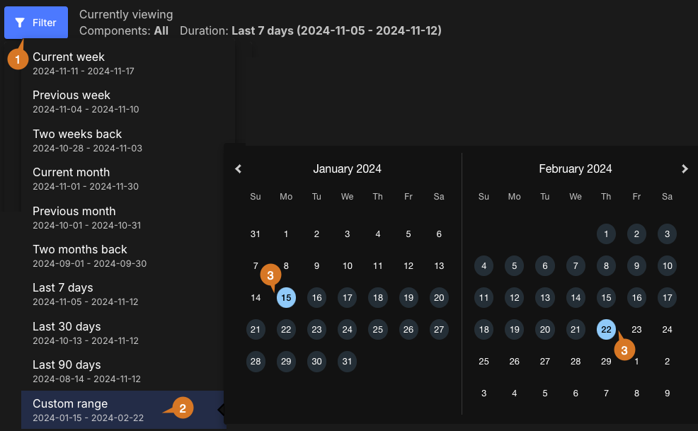
Select a Duration from the following options:
Table 1. Duration filter definitions Duration Definition Current week
Current week in the month, Monday to Sunday schedule. For example, if current day is Tuesday, only data from Monday and Tuesday are displayed.
Previous week
Previous week in the month, Monday to Sunday schedule.
Two weeks back
Two weeks prior in the month, Monday to Sunday schedule.
Current month
First day of current month up to current day.
Previous month
First day to last day of previous month.
Two months back
First day to last day of two months prior.
Last 7 days
The past seven days.
Last 30 days
The past 30 days.
Last 90 days
The past 90 days.
Custom range
-
Select APPLY.
-
The data are filtered accordingly and displayed in the software delivery activity dashboard.
Set a custom date range
To set a custom date range:
-
Select FILTER.
-
Select Custom range.
-
Select dates for the time frame start and end.
The custom date range is set accordingly and displayed in blue on the date picker. You can view the analytics data for any desired time frame, as in the example below:

Chart details and linked information
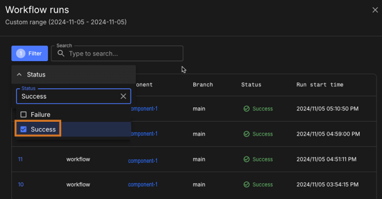
Select any underlined number link in a chart to display a list of more information.
Use the following features to access the chart details:
-
Select FILTER, and then select an option to display.
-
Enter all or part of any column item into Search to search for matches.
-
Some lists include the following links:
-
Component: Select a linked component name to display its summary dashboard in a new browser tab.
-
Repository: Select a repository URL link (not just a file path) to open it in a new tab.
-
PR ID: Select the PR ID link to open the PR URL in a new tab.
-
Run ID: Select a linked run ID to display the run details in a new browser tab.
-
|
Use the following features to access the full dashboard content:
|
Components, workflows, and runs charts
Gain insight into activity, as defined by how many runs are executed and their success rate. The following charts provide an overview for selected components in the chosen time frame:

The charts display the following details:
-
Total number.
-
A donut chart of active vs inactive percentages.
-
Numbers of active and inactive.
-
Numbers of successful and failed runs.
-
A stacked bar chart of numbers of successful vs failed runs, by date.
Components chart
The Components chart displays total, active, and inactive components, where an active component is defined as having one or more workflows executed within the chosen time frame. The number of connected repositories is also displayed.
Select an underlined number link, or a section of the donut chart, to list:
-
Component name
-
Repository URL
-
Status
-
Last activity date and time
If you select a section of the donut chart, or the active or inactive numbers, the data displayed is for only that subset of components.
Workflows chart
The Workflows chart displays total, active, and inactive workflows, where an active workflow is defined as having one or more runs executed within the chosen time frame. The number of connected code branches is also displayed.
Select an underlined number link, or a section of the donut chart, to list:
-
Workflow name
-
Component name
-
Branch name
-
Status
-
Last activity date and time
If you select a section of the donut chart, or the active or inactive numbers, the data displayed is for only that subset of workflows.
Workflow runs chart
The Workflow runs chart displays total, successful, and failed runs. Select an underlined number link, or a stacked bar in the workflow runs chart, to list:
-
Workflow name
-
Component name
-
Branch name
-
Run ID
-
Status
-
Run start time
If you select a stacked bar of the chart, or the success or failure number links, the data displayed is for only that subset of runs.

Trend charts: commits, PRs, and code churn
Get an overview of development trends for selected components in the chosen time frame, to better understand developer activity and resourcing.
Coding trends are displayed in three charts:

As in the PR trend example above, hover over any date in the charts to view the data for that date.
Commits trend chart
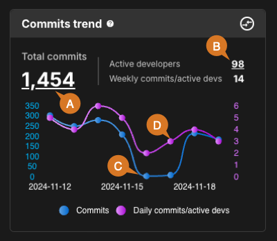
The Commits trend chart displays numbers of commits made, grouped by date and per active developer. An active developer is defined as a user who has made at least one commit during the selected time frame.

The trend chart includes the following:
-
Total commits: Select the underlined number link to display the commit details:
-
Commit ID
-
Component name
-
Repository path
-
Branch
-
Author email
-
Commit date and time
-
-
Active developers: Select the underlined number link to list the active developer email and the number of total commits made by that developer.
-
Total commits graph (scale on left y-axis).
-
Commits per active developers graph (scale on right y-axis). For selected time frames less than a week, the graph displays daily commits per active developer; otherwise, weekly commits are displayed.
| Hover over a date to display the number of commits and commits per active developer for that date, or select it to display the commits trend details on that date. |
PRs trend chart
The Pull requests trend chart displays numbers of PRs created, grouped by date and status.
The trend chart includes the following:
-
Total PRs: Select the underlined number link to display the PR details:
-
PR ID
-
Component name
-
Repository file path
-
Source branch
-
Target branch
-
PR status
-
Created date and time
-
-
PRs by status: Approved, Changes requested, Open, Rejected.
-
Hover over a date to display the number of PRs created and their status for that date, or select it to display the PR trend details on that date.
Code churn chart
Code churn tracks the number of lines of code additions and deletions for the selected components in the chosen time frame.
Hover over a chart point to display the code churn summary for that date.
Code progression snapshot
The Code progression snapshot shows the journey of code from commits to deployment for the selected components in the chosen time frame.
Code progression is displayed in three charts:
You must specify the kind in your workflow step to populate these charts, and distinguish between builds and deployments.
For more information, refer to Associate run data with analytics dashboards.
|

Run-initiating commits chart
A run-initiating commit is defined as a commit which triggers a workflow run. Select the underlined number link to display the list of commits that have started a run during the selected time frame.
The run-initiating commits list includes:
-
Commit ID
-
Commit description
-
Run ID
-
Status
-
Created date and time
-
Component name
-
Environment
Builds chart
The Builds chart provides an overview of successful and failed builds for the selected components and time frame.
Select an underlined number link to display a list of more information, including:
-
Run ID
-
Status
-
Start date and time
-
Duration
-
Component name
-
Workflow name
Successful deployments chart
The Successful deployments chart provides an overview of successful deployments for the selected components and time frame.
Select the underlined number link to display a list of more information, including:
-
Run ID
-
Start date and time
-
Duration
-
Component name
-
Workflow name
-
Environment
Successful build duration
Identify performance issues by monitoring build duration for the filtered component data in the chosen time frame. For each component, a box plot displays how long each build has taken.
Hover over a plot to display the minimum, median, and maximum build durations for that component.
You must specify kind: build in your workflow step to populate this chart.
For more information, refer to Associate run data with analytics dashboards.
|
Deployment overview chart
Analyze deployment for the selected components in the chosen time frame. Hover over a bar on the chart to display the number of successful and failed deployments for the specified date.
You must specify kind: deploy in your workflow step to populate this chart.
For more information, refer to Associate run data with analytics dashboards.
|
Development cycle time chart
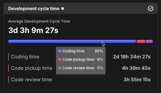
Use the development cycle time chart to identify bottlenecks in your system for the selected components in the chosen time frame.
The development cycle time can be defined by three phases:
-
Coding: The time drafting code for a PR.
-
Pickup: The time from PR creation to PR review.
-
Review: The time from PR review to merging into the codebase.

As in the example above, hover over the bar chart to display the percentage of time spent in each phase.
Average deployment time chart
Track how long deployment takes, on average, for the selected components in the chosen time frame. Each environment is displayed as a bar chart, with the maximum and minimum times at each end. The average is indicated by the blue bar.
You must specify kind: deploy in your workflow step to populate this chart.
For more information, refer to Associate run data with analytics dashboards.
|
Compare metrics
Use this feature to compare metrics among all organizations and sub-organizations in the tenant. You can compare metrics within select charts in the analytics dashboards. In the generated list of all organizations/sub-organizations, sort by the org/sub-organization name or its status. Select an organization to drill down to the component level to display a more fine-grained status list. Hover over a status item to display more information.
|
You can only compare metrics for charts with |
To compare metrics:
-
Select Analytics on the left pane, and then select a dashboard.
-
Select any
 on the upper right of a chart to display the list of organizations/sub-organizations and their status.
The number of items in the compare metrics list equals the total displayed in the chart. -
(Optional) Hover over a status to display more information.
-
(Optional) Select
 or
or  next to a column heading to sort on that heading.
 -
(Optional) Select an organization to list more information about each sub-organization and/or component within that organization.
-
(Optional) Select a sub-organization to list more details about each sub-organization and/or component within that sub-organization.
The list of the status of all organizations/sub-organizations/components for the specific metric is displayed.
Customize the dashboard
Customize the dashboard to display only the charts and tables that matter the most to you.
|
Only charts and tables with |
To customize the dashboard:
-
Select Analytics on the left pane, and then select the dashboard.
-
Select
 on the top right of the dashboard.
 -
Select Edit dashboard.
-
(Optional) Remove a chart or table from the dashboard.
-
Select
 next to the chart or table you want to remove.
 -
Select Save.
-
-
(Optional) Add back a chart or table to the dashboard.
-
Select Add chart/table to display a list of the available charts or tables.
-
Select Add to dashboard next to the item to add.
-
Select Apply.
-
-
(Optional) Rearrange items on the dashboard by dragging them into place.
The dashboard is customized accordingly.