Flow metrics is a framework that connects business strategy with software delivery, by providing a view of value flow and correlating it with expected business outcomes. In the CloudBees Unify, flow metrics helps organizations measure business performance, from customer request to software delivery.
By monitoring flow metrics, you can have improved predictability, bottleneck identification, better risk management, and more cost-effective software delivery.
The CloudBees Unify calculates five flow metrics that measure how value flows through a product value stream, as follows:
| Metric | Description |
|---|---|
Work load |
Number of flow items currently in progress |
Work items distribution |
Proportion of each flow item type |
Velocity |
Number of completed flow items |
Cycle time |
Time it takes to complete a flow item from start to finish |
Efficiency |
Percentage of active time vs total cycle time |
CloudBees categorizes work tasks for a given product value stream into four flow item types:
-
Feature (a business value)
-
Risk (possible lack of security or compliance)
-
Bugs (a coding defect)
-
Tech debt (a potential blocker to future delivery)
A flow item is considered to be in progress if it is started but not yet complete. The total time for a flow item to complete includes both time spent actively working on the flow item, and time spent in waiting, such as for a code review or approval.
|
Use the following features to access the data on this dashboard:
|
Access and filter flow metrics
Flow metrics data helps you measure the effectiveness of your business in delivering value. Filter on a workflow group and a timeline duration.
To access and filter flow metrics views:
-
Select the next to Analytics on the left pane.
-
Select DORA and flow metrics insights.
Table 2. Duration filter definitions Duration Definition Current week
Current week in the month, Monday to Sunday schedule. For example, if current day is Tuesday, only data from Monday and Tuesday are displayed.
Previous week
Previous week in the month, Monday to Sunday schedule.
Two weeks back
Two weeks prior in the month, Monday to Sunday schedule.
Current month
First day of current month up to current day.
Previous month
First day to last day of previous month.
Two months back
First day to last day of two months prior.
Last 7 days
The past seven days.
Last 30 days
The past 30 days.
Last 90 days
The past 90 days.
Custom range
You are displaying flow metric views, listed according to any sorting, filtering, or searching you have done.
Set a custom date range
To set a custom date range:
-
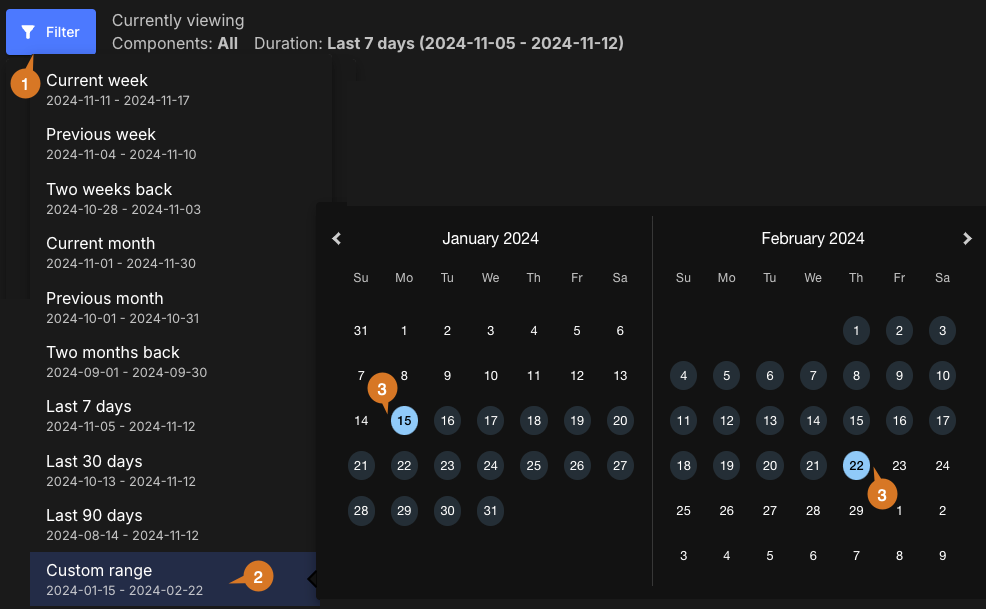
Select FILTER.
-
Select Custom range.
-
Select dates for the time frame start and end.
The custom date range is set accordingly and displayed in blue on the date picker. You can view the analytics data for any desired time frame, as in the example below:
Customize the dashboard
Customize the dashboard to display only the charts and tables that matter the most to you.
|
Only charts and tables with |
To customize the dashboard:
-
Select Analytics on the left pane, and then select the dashboard.
-
Select
 on the top right of the dashboard.
 -
Select Edit dashboard.
-
(Optional) Remove a chart or table from the dashboard.
-
Select
 next to the chart or table you want to remove.
 -
Select Save.
-
-
(Optional) Add back a chart or table to the dashboard.
-
Select Add chart/table to display a list of the available charts or tables.
-
Select Add to dashboard next to the item to add.
-
Select Apply.
-
-
(Optional) Rearrange items on the dashboard by dragging them into place.
The dashboard is customized accordingly.
Explore work load, work items distribution, and velocity

-
Work load: Review the work load of the team for a selected period. Work load measures the number of flow items currently in progress within a specific value stream, which is an indicator of productivity. An increasing workload suggests excess work in progress, which can lead to future increases in flow item completion time. Frequent software delivery reduces workload and improves cycle time and velocity. In this example, for the selected component and duration, 100 work items are in progress: the sum of bugs, features, risk, and tech debt.
-
The total average number of work items in progress is a link that displays a list of flow item types that includes:
-
Issue ID
-
Issue type
-
Summary
-
Assigned to
-
Issue created
-
Flow item type
-
-
-
Work items distribution: The distribution of completed work item types for the selected duration. Work items distribution measures the proportion of each flow item type, over time, in a given value stream. Monitoring work items distribution helps prioritize specific types of work during different product lifecycle stages. For new business features, this helps to balance the mitigation of risk, bugs, and technical debt.
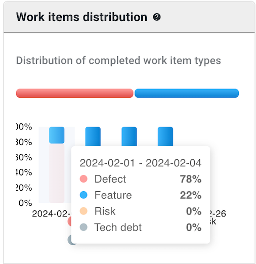 Figure 3. Example Work items distribution chart.
The graph above indicates that 22% of team effort is on feature and 78% is on defects.
-
Velocity: Throughput of the value stream, measured as the number of completed flow items within a given time frame. An increase in velocity over time signals that productivity is improving. Tracking velocity is helpful to forecast software delivery rates, and to uncover any problems at an early stage. In the example below, 241 work items are completed, by type.
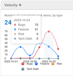 Figure 4. Example Velocity chart.
The above graph indicates that for the particular date, the team has worked on 70 defects and 31 features, and has not worked on any risk or tech debt items.
Select a chart to explore Workload, Work items distribution, and Velocity

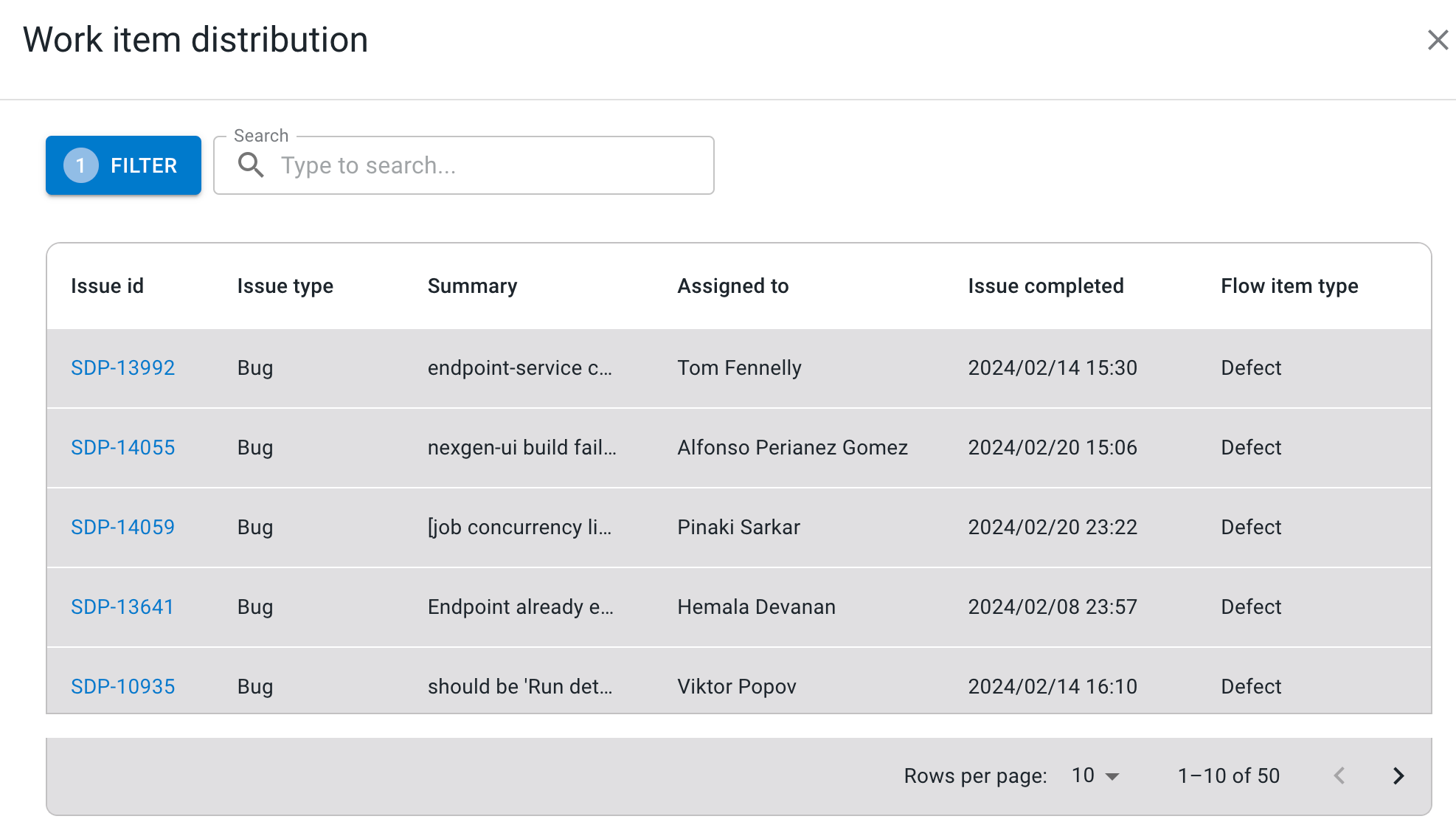
Hover the cursor over the lines of the workload and velocity charts to display the data with the start and end dates. Select the red area of the work items distribution chart to display the work items distribution filtered by defect.
Explore cycle time, and work efficiency
Hover the cursor over the lines of the Cycle time and Work efficiency charts to display the data with the start and end dates.

-
Cycle time: The sum of active work time and wait time. Cycle time gauges time to market by measuring how long it takes to complete a flow item from start to finish, including both active and wait times. As you increase the speed of your software delivery, you reduce the cycle time. With detailed data of flow item completion times, you can predict future cycle times with confidence, and better understand the efficiency of your value stream. This example displays the average time taken to create and then close an issue in Jira.
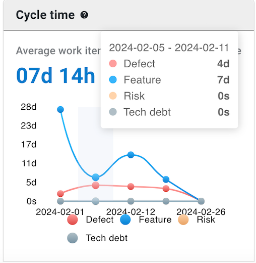 Figure 8. Example Cycle time chart
The above graph indicates that on average for the selected duration, four days were spent on fixing defects, and seven days on feature.
-
Work efficiency: The average active work time. The graph below displays that 62% is the average active work time and 38% is the work wait time.
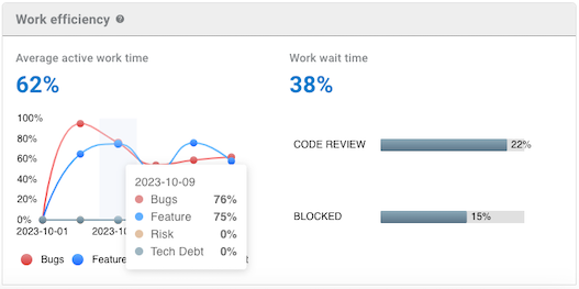 Figure 9. Example Work efficiency chart
The above graph indicates that for:
-
Defects, 76% is active time, with the remaining 24% wait time.
-
Feature, 75% is active time, with the remaining 25% wait time.
-
The 38% Work wait time, 22% is spent on code review, and 15% on blocked.
-
Select the total average active work time link to display a list of flow item type that includes:
-
Issue ID
-
Issue type
-
Summary
-
Active time
-
Waiting time
-
Efficiency
-
Flow item type
-
-
Compare metrics
Use this feature to compare metrics among all organizations and sub-organizations in the tenant. You can compare metrics within select charts in the analytics dashboards. In the generated list of all organizations/sub-organizations, sort by the org/sub-organization name or its status. Select an organization to drill down to the component level to display a more fine-grained status list. Hover over a status item to display more information.
|
You can only compare metrics for charts with |
To compare metrics:
-
Select Analytics on the left pane, and then select a dashboard.
-
Select any
 on the upper right of a chart to display the list of organizations/sub-organizations and their status.
The number of items in the compare metrics list equals the total displayed in the chart. -
(Optional) Hover over a status to display more information.
-
(Optional) Select
 or
or  next to a column heading to sort on that heading.
 -
(Optional) Select an organization to list more information about each sub-organization and/or component within that organization.
-
(Optional) Select a sub-organization to list more details about each sub-organization and/or component within that sub-organization.
The list of the status of all organizations/sub-organizations/components for the specific metric is displayed.