The CloudBees Unify Test insights dashboard provides users with a comprehensive view of all testing metrics in their projects. Software testing is invaluable to improve code quality, performance, and security.
You can publish test result data from any of the following sources:
-
CloudBees Unify workflow runs.
-
GitHub Actions (GHA) workflow runs.
-
CloudBees CI pipeline runs.
-
Jenkins® pipeline runs.
Test insights charts display components, workflows, and runs with and without test suites. An overview table of each test suite contains links to more information.
Use Test insights to:
-
Better understand test execution behaviors, especially which components currently have failing tests and must be resolved as soon as possible.
-
Detect and fix components with commonly failing or unstable test results.
-
Detect components that have not yet been tested.
-
Determine which test cases take the longest to run. Optimize these to reduce build times and speed up deployments.
| You can view test results from a specific run in the Test results tab of Run details. |
Prerequisites
Check the following prerequisites to make sure you have correctly configured your pipeline or workflow to collect test results for populating the Test insights dashboard.
| Pipeline or workflow type | Required configuration to collect test results |
|---|---|
CloudBees Unify workflow |
Add the CloudBees Unify publish test results action to a CloudBees Unify workflow that executes a test. |
GHA workflow |
Add the GHA publish test results action to a GHA workflow that executes a test. |
Use a CloudBees Unify workflow to run a CloudBees CI job |
Add the Run a CloudBees CI job action to a platform workflow, and set the |
Use a CloudBees Unify workflow to run a Jenkins job |
Add the Run a Jenkins job action to a platform workflow, and set the |
[1] CloudBees suggests that you use this method if you are running a Multibranch Pipeline, as you can then view your pipeline jobs and builds directly within the CloudBees Unify UI.
Access and filter test insights charts
Select the time frame of data for analysis for charts in the Test insights dashboard. By default, the last seven days of data are displayed. An option to select a component to filter on is available only if you have not yet selected a specific component.
-
Select .
-
(Optional) Filter for the chart data you want to display by selecting the following:
-
Select the FILTER above the charts.
-
Select one or more Components from the options, if available. If you have already selected a component prior to selecting Test insights, that selection is maintained.
-
Select a Duration from the following options:
Table 2. Duration filter definitions Duration Definition Current week
Current week in the month, Monday to Sunday schedule. For example, if current day is Tuesday, only data from Monday and Tuesday are displayed.
Previous week
Previous week in the month, Monday to Sunday schedule.
Two weeks back
Two weeks prior in the month, Monday to Sunday schedule.
Current month
First day of current month up to current day.
Previous month
First day to last day of previous month.
Two months back
First day to last day of two months prior.
Last 7 days
The past seven days.
Last 30 days
The past 30 days.
Last 90 days
The past 90 days.
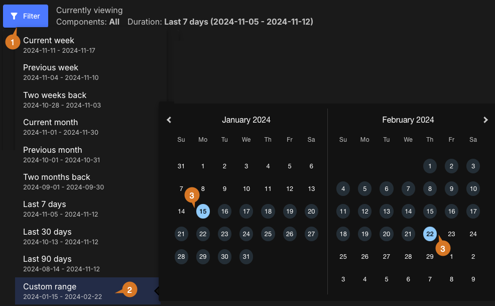
Custom range
-
Select APPLY.
-
The data are filtered accordingly and displayed in the test insights charts.
Set a custom date range
To set a custom date range:
-
Select FILTER.
-
Select Custom range.
-
Select dates for the time frame start and end.
The custom date range is set accordingly and displayed in blue on the date picker. You can view the analytics data for any desired time frame, as in the example below:
|
Use the following features to access the data on this dashboard:
|
Components, workflows, and runs information
Get an overview of components, workflows, and workflow runs for the filtered component data in a specified time frame.
The dashboard charts display the following with and without test suites:
-
Components
-
Workflows
-
Workflow runs

Each chart displays the following details (highlighted in the Workflows chart above):
-
Total number.
-
A donut chart of those with and without test suites (in percentages).
-
Numbers of those with and without test suites.
| The Components chart also displays the number of associated repositories, and the Workflows chart displays the number of associated branches. |
Components chart links
Select a number, or a section of the donut chart, to list the:
-
Component name
-
Repository URL
-
Number of test suites
| If you select a section of the donut chart, or the with or without test suites numbers, the data displayed is for only that subset of components. |
In the list, perform any of the following:
-
Select FILTER to filter by with or without test suites.
-
Search for specific components by entering all or part of any column item into Search.
-
Select
 or
or  next to a column heading to sort on that heading.
 -
Select a component name to display its component summary in a new browser tab.
-
Select a repository URL to display the repository in a new browser tab.
Workflows chart links
Select a number, or a section of the donut chart, to list the:
-
Workflow name
-
Component name
-
Branch name
-
Number of workflow runs
-
Number of test suites
| If you select a section of the donut chart, or the with or without test suites numbers, the data displayed is for only that subset of workflows. |
In the list, perform any of the following:
-
Select FILTER to filter by with or without test suites.
-
Search for specific workflows by entering all or part of any column item into Search.
-
Select
 or
or  next to a column heading to sort on that heading.
 -
Select a component name to display its component summary in a new browser tab.
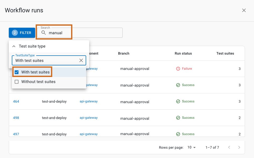
Workflow runs chart links
Select a number, or a section of the donut chart, to list the:
-
Run ID
-
Workflow name
-
Component name
-
Branch name
-
Run status
-
Number of test suites
| If you select a section of the donut chart, or the with or without test suites numbers, the data displayed is for only that subset of workflow runs. |
In the list, perform any of the following:
-
Select FILTER to filter by with or without test suites.
-
Search for specific runs by entering all or part of any column item into Search.
-
Select
 or
or  next to a column heading to sort on that heading.
 -
Select a run ID to display the run details in a new browser tab.
-
Select a component name to display the component summary in a new browser tab.
Tests overview
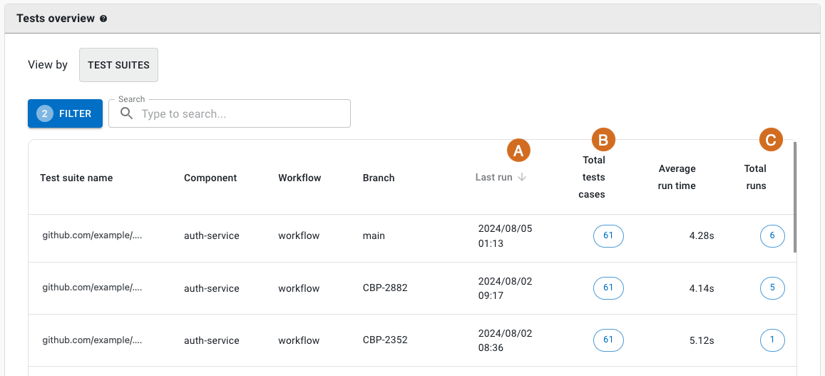
The filterable tests overview lists details of all test suites run. Display either by Test suites or by Components views.
| Detail listed | in Test suites view? | in Components view? |
|---|---|---|
Test suite name |
|
|
Component name |
|
|
Default branch name |
|
|
Workflow name |
|
|
Last run date and time |
|
|
|
|
|
Average run time |
|
|
|
|
|
Failure rate on last run |
|
|
Failure rate (overall) |
|
|
|
Select |
Select from any or all of the following to filter for a specific subset of tests:
-
Test suite name
-
Component name
-
Workflow name
-
Branch name
To access and filter the tests overview:
-
Select .
-
Select a view:
-
TEST SUITES
-
COMPONENTS
-
-
(Optional) Select FILTER, and then select one or more of the options.
-
(Optional) Search for specific test suites by entering all or part of any column item into Search.
The data are filtered accordingly and displayed in Tests overview.
|
In the Components view, hover over Failure rate to display the totals of:
|
Test cases details
In either view, select an item from the Total test cases column to display the following:
-
Test case name
-
Average test run duration
-
Total test runs
-
Test failure rate
-
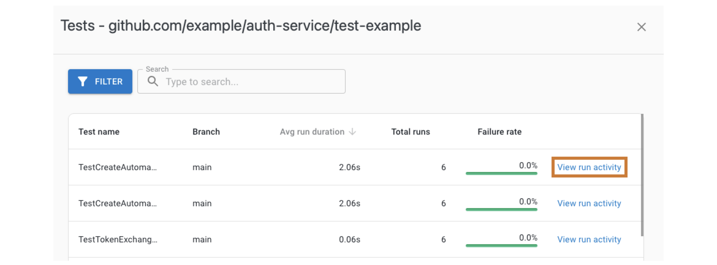 Figure 5. Example test cases list with run activity link highlighted.
Test run activity
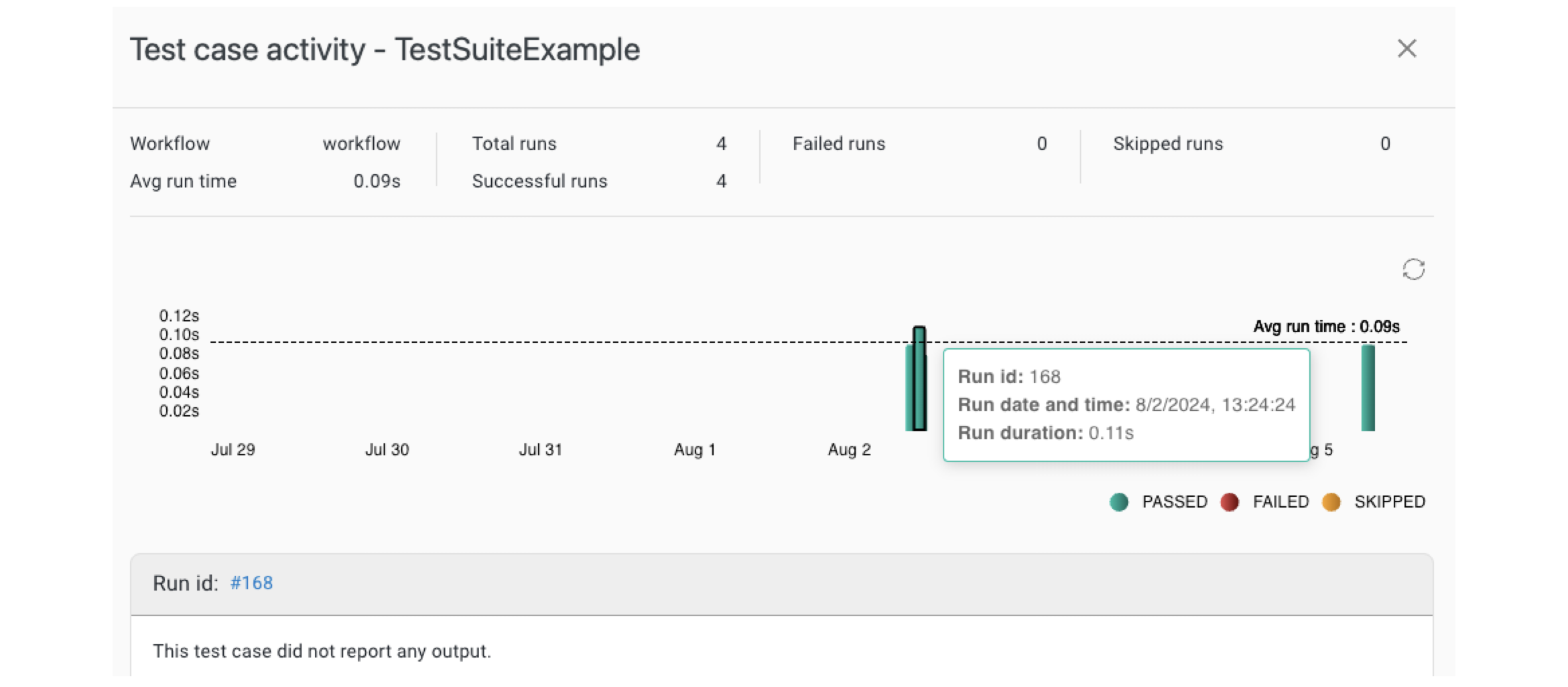
Select Total test cases in either view, and then select View run activity next to a test case to display a bar graph of test case activity.
The following information is listed above the test run activity graph:
-
Workflow name
-
Test average run time
-
Number of total, successful, failed, and skipped runs.
Each bar on the graph represents a workflow run. Select a bar to display the:
-
Workflow run ID
-
Run date and time
-
Run duration
Below the graph is the run ID linking to the run details, and any test output.
Total runs details
In the Test suites view, select an item from the Total runs column to display the following:
-
Run time
-
Run ID: select to display run details in a new browser tab.
-
Run status
-
Total test cases
-
Number of failed test cases
Compare metrics
Use this feature to compare metrics among all organizations and sub-organizations in the tenant. You can compare metrics within select charts in the analytics dashboards. In the generated list of all organizations/sub-organizations, sort by the org/sub-organization name or its status. Select an organization to drill down to the component level to display a more fine-grained status list. Hover over a status item to display more information.
|
You can only compare metrics for charts with |
To compare metrics:
-
Select Analytics on the left pane, and then select a dashboard.
-
Select any
 on the upper right of a chart to display the list of organizations/sub-organizations and their status.
The number of items in the compare metrics list equals the total displayed in the chart. -
(Optional) Hover over a status to display more information.
-
(Optional) Select
 or
or  next to a column heading to sort on that heading.
 -
(Optional) Select an organization to list more information about each sub-organization and/or component within that organization.
-
(Optional) Select a sub-organization to list more details about each sub-organization and/or component within that sub-organization.
The list of the status of all organizations/sub-organizations/components for the specific metric is displayed.