DevOps Research and Assessment (DORA) metrics can measure the performance of DevOps teams. CloudBees Unify displays each of the four key DORA metrics with an associated percentile performance rating and the percentage change from the previous timeframe.
The four key DORA metrics:
-
Deployment frequency
-
Deployment lead time
-
Change failure rate
-
Mean time to recovery (MTTR)
DORA metrics thresholds are configurable.
|
Use the following features to access the data on this dashboard:
|
Access DORA metrics
Filter the four DORA metrics views by duration and by comparing them with other groups or by workflow.
To access and filter DORA metrics views:
-
Select the next to Analytics on the left pane, select DORA metrics, and then select FILTER.
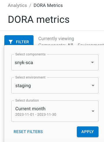 Figure 1. Select components, environment, and duration.
-
Select one or more components from the options.
-
Select an environment from the options.
-
Select a Duration from the following options:
Table 1. Duration filter definitions Duration Definition Current week
Current week in the month, Monday to Sunday schedule. For example, if current day is Tuesday, only data from Monday and Tuesday are displayed.
Previous week
Previous week in the month, Monday to Sunday schedule.
Two weeks back
Two weeks prior in the month, Monday to Sunday schedule.
Current month
First day of current month up to current day.
Previous month
First day to last day of previous month.
Two months back
First day to last day of two months prior.
Last 7 days
The past seven days.
Last 30 days
The past 30 days.
Last 90 days
The past 90 days.
Custom range
-
Set a custom date range
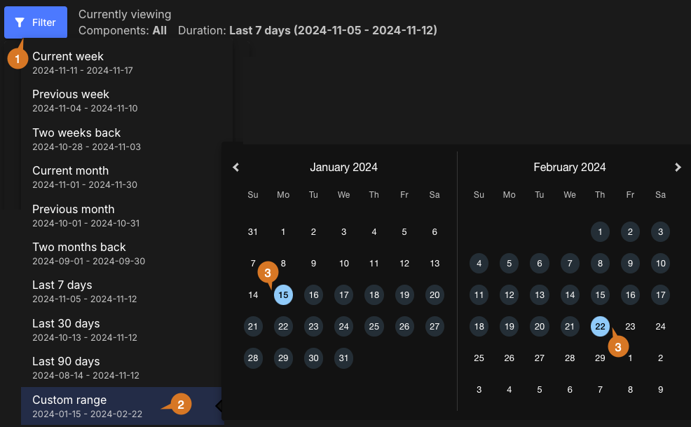
To set a custom date range:
-
Select FILTER.
-
Select Custom range.
-
Select dates for the time frame start and end.
The custom date range is set accordingly and displayed in blue on the date picker. You can view the analytics data for any desired time frame, as in the example below:
Customize the dashboard
Customize the dashboard to display only the charts and tables that matter the most to you.
|
Only charts and tables with |
To customize the dashboard:
-
Select Analytics on the left pane, and then select the dashboard.
-
Select
 on the top right of the dashboard.
 -
Select Edit dashboard.
-
(Optional) Remove a chart or table from the dashboard.
-
Select
 next to the chart or table you want to remove.
 -
Select Save.
-
-
(Optional) Add back a chart or table to the dashboard.
-
Select Add chart/table to display a list of the available charts or tables.
-
Select Add to dashboard next to the item to add.
-
Select Apply.
-
-
(Optional) Rearrange items on the dashboard by dragging them into place.
The dashboard is customized accordingly.
Prerequisites
-
To populate DORA metrics, use one of the following methods depending on your workflow type:
-
For CloudBees Unify workflows, specify the step kind as
kind:deployin the workflow YAML for your deployment operations, as noted in Associate run data with analytics dashboards. -
For GitHub Actions, add the action to register a build artifact and the action to register a deployed artifact to your workflow. Learn more at GitHub Actions and CloudBees Unify: Getting started.
-
For integrated CloudBees CI or Jenkins Multibranch Pipelines, configure your Jenkinsfile to add an artifact registration step and a deployed artifact registration step. Learn more at Get started with CloudBees CI / Jenkins® and CloudBees Unify.
-
-
You must also have at least one environment defined.
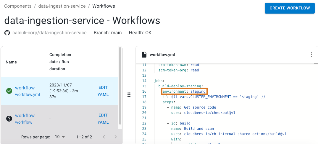 Figure 3. Specify the environment on the job level
Explore Deployment frequency and MTTR

-
Deployment frequency: The reading depicts the average number of successful deployments for the selected component and environment, per day. Select the Average per day link to display a list of successful deployments, for the selected Component and Environment.
-
Deployment lead time: The reading depicts that it takes four minutes and two seconds to deploy from the time the PR is approved. Select the Average duration link to display a list of successful deployments, for the selected Component and Environment.
-
Change failure rate:The reading tells what percentage the deployments have failed for the selected component(s) and duration to the selected environment.
-
MTTR: The reading depicts how much time it takes for the failed deployments to resolve.
Deployment frequency and Lead time trend
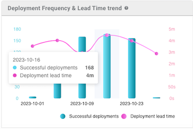
The above graph displays the successful deployments and deployment lead time over weeks when the user selects month duration. If the user selects week duration, it shows the data per day.
Explore Failure rate and MTTR trend
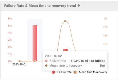
The above graph displays the Failure rate and mean time to recovery over weeks.
Compare metrics
Use this feature to compare metrics among all organizations and sub-organizations in the tenant. You can compare metrics within select charts in the analytics dashboards. In the generated list of all organizations/sub-organizations, sort by the org/sub-organization name or its status. Select an organization to drill down to the component level to display a more fine-grained status list. Hover over a status item to display more information.
|
You can only compare metrics for charts with |
To compare metrics:
-
Select Analytics on the left pane, and then select a dashboard.
-
Select any
 on the upper right of a chart to display the list of organizations/sub-organizations and their status.
The number of items in the compare metrics list equals the total displayed in the chart. -
(Optional) Hover over a status to display more information.
-
(Optional) Select
 or
or  next to a column heading to sort on that heading.
 -
(Optional) Select an organization to list more information about each sub-organization and/or component within that organization.
-
(Optional) Select a sub-organization to list more details about each sub-organization and/or component within that sub-organization.
The list of the status of all organizations/sub-organizations/components for the specific metric is displayed.