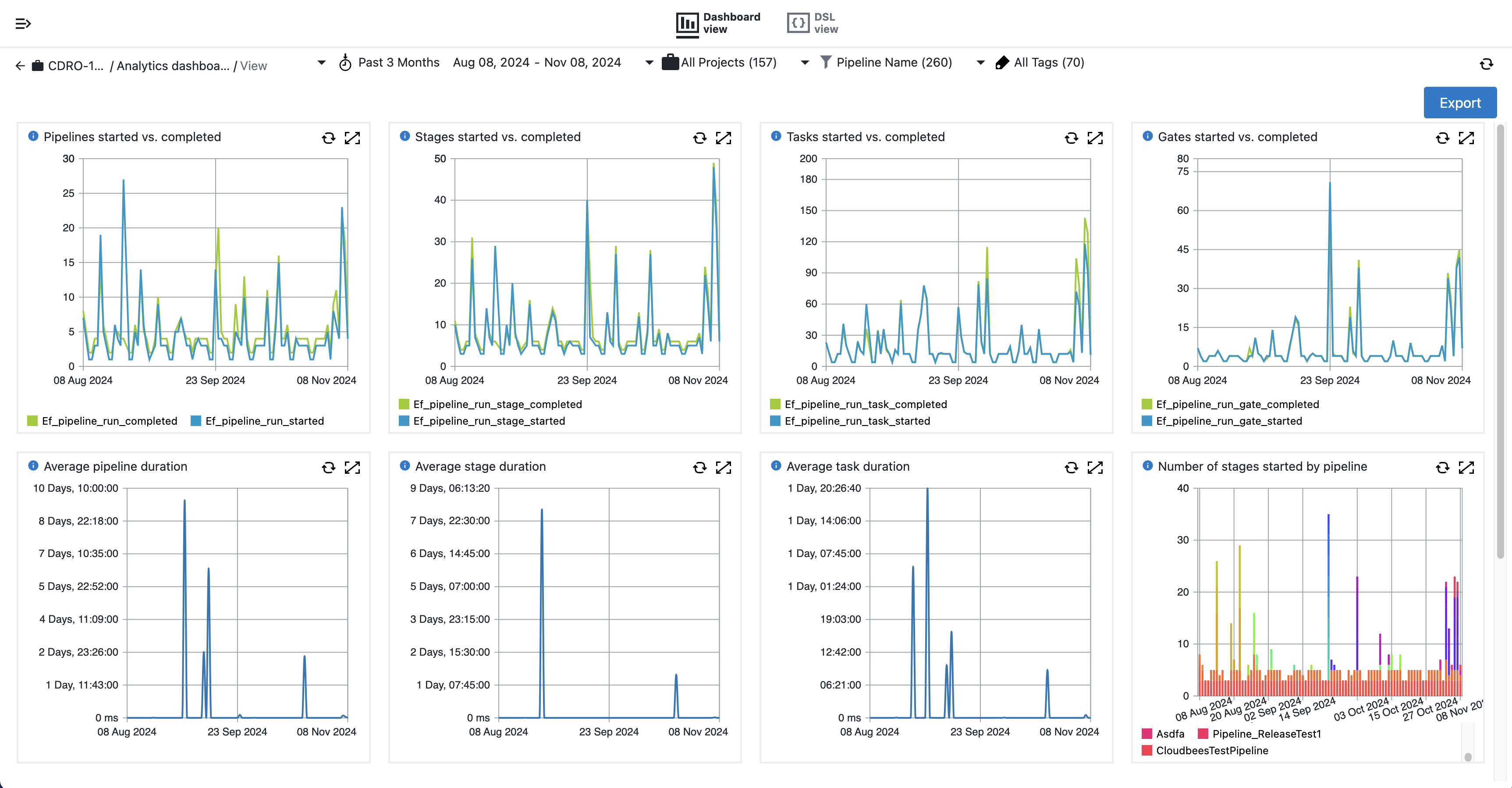
The Pipeline Stats dashboard displays key metrics to gain insight into your organization’s pipeline performance. This dashboard provides insights into the following:
-
Underlying problems in pipeline performance and health.
-
Trends in pipeline execution duration and frequency.
This dashboard directly helps an organization’s infrastructure teams, developers, and engineering managers who are involved in managing pipeline performance to identify patterns and optimize pipeline efficiency.
Access Pipeline Stats
To access the Pipeline Stats dashboard:
-
Select Analytics from the top CloudBees navigation to display the CloudBees Analytics dashboards list.
If Analytics is not active from the CloudBees navigation, select Learn more for licensing information. -
Select Pipeline Stats from the list to display the dashboard.
 Figure 1. Pipeline dashboard
Filters
Use the filters to customize and refine the widget visualizations to your relevant data. The available filters are described below.

The following filters are available to customize your dashboard display:
-
Time filter: Pipeline run metrics for the past three months are displayed by default. Select the arrow to choose a different date range, or select the Custom… option to specify a custom date range.
-
Project: Select which project metrics to include in the dashboard visualizations. By default, metrics for all projects are included.
-
Pipeline Name: Select which pipeline metrics to include in the dashboard visualizations. By default, metrics for all pipelines are included.
-
Tags: Filter the pipelines based on the tags marked on the pipeline. Metrics for all pipelines are displayed by default. Example tag formats include
nightly backuporenv=prod. Refer to object tags for more information.
Visualizations
The following visualizations are included in the Pipeline Stats dashboard.
Pipelines started vs. completed
Line graph showing the number of pipelines started verses those completed for the filter results.
Stages started vs. completed
Line graph showing the number of stages started verses those completed for the filter results.
Tasks started vs. completed
Line graph showing the number of tasks started verses those completed for the filter results.
Gates started vs. completed
Line graph showing the number of gates started verses those completed for the filter results.
Export dashboard results
CloudBees CD/RO dashboards can be exported as PDFs. For more information, refer to Export dashboards to PDF.
| If you need more refined results, you can also Create a report and Export reports results. |